

In short
In real estate, the image determines whether someone opens a listing or keeps scrolling. Property photographs and supporting design serve different purposes: platforms expect the actual home, while agency websites, presentations, banners, and posts can use ready-made visuals. The essential rule is simple: never add features that the property does not have.
Why do visuals matter more than text in real estate?
Because the first image drives the decision to view a property. People scan a results page and give each listing only a moment of attention; they read the headline after their eyes have judged the picture. Most listing descriptions sound broadly similar, but the quality of their visuals can differ dramatically.
This leads to a familiar mistake: an agent invests in the description but neglects the photographs. A dark hallway shot vertically with a shaky hand costs more than it seems, because it denies the listing a fair chance before the buyer reads a word.
There is also everything surrounding the listing: the agency website, a pitch to the owner, a neighborhood post, a mortgage banner, or the cover of a curated selection. None of these needs a photograph of a specific apartment, yet all of them need visual material regularly.
Where do agents and developers need images?
It helps to divide the work into “show this property” and “show everything around it.” The second group is exactly where stock imagery is useful.
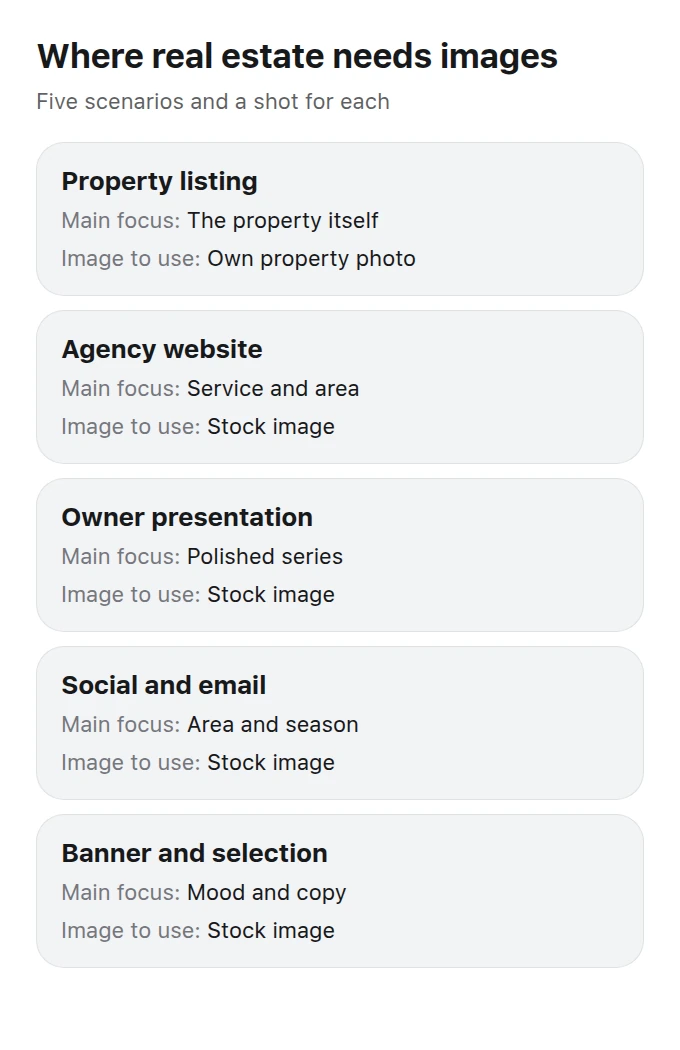
Five scenarios: the property itself matters in a listing; neighborhood, style, and mood matter everywhere else.
Agency websites and landing pages. Hero areas, service sections, inquiry-form backgrounds, and neighborhood pages. These images do not have to show one of your properties, and it is usually better when they do not.
Presentations for owners and investors. Section dividers, covers, and illustrations for a sales strategy. A polished and coherent look matters here, not documentary accuracy.
Social media and newsletters. Posts about a neighborhood, infrastructure, the season, or mortgages. This content appears frequently, and arranging a new photo shoot every time is impractical.
Advertising and banners. The image must work with the copy, which means leaving clear space for the headline and price instead of filling every corner with detail.
Covers for curated selections. “Apartments near transit,” “Homes with land,” or “New developments by a park” need atmospheric images that are not presented as a particular listing.
How can you show a neighborhood when there is nothing useful to photograph?
Use representative everyday scenes rather than specific addresses. A neighborhood post rarely needs a picture of one particular building: a waterfront, a leafy courtyard, a school or daycare, a coffee shop in the morning, parking, a playground, or a broad city view can tell the story. Ready-made images cover these themes without bringing an unrelated facade or another business’s prominent sign into the message.
There is one important boundary: an atmospheric neighborhood image must not look like documentary evidence of the surroundings of a specific listing. If a property post shows somebody else’s waterfront or park, a buyer arriving for a viewing will feel misled even if no formal complaint follows. Keep the roles separate: neighborhood editorial content may create atmosphere, while the property card must show only the home’s real surroundings.
A practical approach is to build a folder of five to seven seasonal images for every area where your agency works. The same compact set can support posts, curated-selection covers, market updates, and presentations for months. It also makes the agency feed feel like one considered series instead of an assortment collected in a hurry.
What do listing platforms require from property photos?
In short, the photos must show the property being offered and must not mislead the viewer. Every listing platform has its own published help and content rules, so read the original requirements of the service you use rather than relying on someone else’s summary.
The practical conclusion is straightforward: a generated image cannot replace a photograph of the apartment in its listing. That remains true even when the generated image looks better or appears “close enough” to the real space.
Virtual staging deserves separate treatment. An empty room may be shown with furniture, but the image must be clearly labeled as a visualization. It must not alter anything intrinsic to the property, including the layout, windows, view, or actual condition of the finishes.
What must not be added or changed
The floor plan or area. The view from a window. The condition of walls, floors, and ceilings. The floor level or surroundings. A balcony that does not exist. Sunlight in a room that never receives it.
What is acceptable with a label
Furniture placement in an empty room. Removal of small pieces of litter. Perspective correction and color balancing. An alternative finish presented as a “design example,” never as an existing fact.
How should you prepare images for a listing and its supporting materials?
Use a sequence that saves time while protecting the accuracy of the listing and avoiding preventable problems with the platform.
Photograph the property honestly
Use daylight, a tripod or stable support, a level horizon aligned with the windowsill, and straight verticals. An ordinary phone is sufficient when the lens is clean and you avoid shooting directly against the light.
Select and correct the photographs
Correct vertical lines and white balance, then arrange the images in a logical order. This is normal processing rather than substitution: the layout, dimensions, permanent features, and actual condition remain unchanged.
Label every visualization
Anything added digitally should be identified both on the image and in the listing text. A clear label answers the question before a viewing and prevents a decorative concept from being mistaken for evidence.
Use ready-made images for everything else
Neighborhood themes, mood, mortgage content, curated selections, websites, and presentations belong in a stock library. You can assemble a coherent collection once and prepare enough supporting material for the coming season.
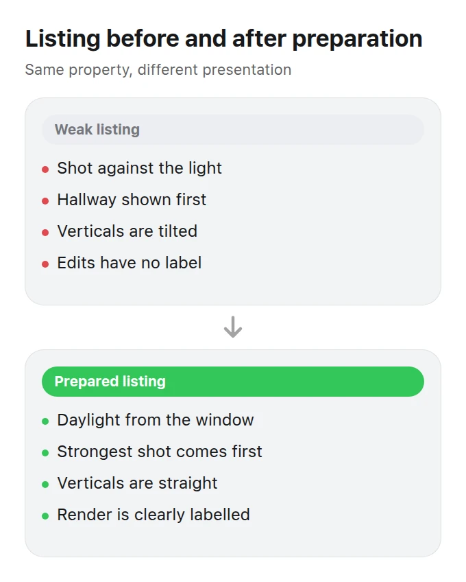
The same home in a weak and a prepared listing: light, image order, and honest labels change, while the property itself does not.
How do visuals help when speaking with a property owner?
They make the agency’s work tangible. Owners often compare agencies mainly by commission because every other promise sounds much the same. A presentation that lays out the sales plan with polished images shifts the discussion from the price of the service to how the property will appear beside competing listings in search results.
Three elements are especially useful in that presentation: examples of your own strong listings rather than somebody else’s work, a clear plan for preparing the property for photography, and atmospheric divider images that maintain one visual style. The first two demonstrate your expertise; a coherent stock-image selection can provide the third in about ten minutes.
The reverse comparison is effective too: show the owner how the property currently appears in search results. A dark hallway placed next to well-prepared photographs from competing local listings makes the need for a reshoot clearer than a long argument about image quality.
Checklist before publication
- The property card contains photographs of that property only.
- Every visualization is labeled, and the label is readable without zooming.
- The layout, window view, and condition of the finishes have not been changed.
- Vertical lines are straight and the white balance is neutral.
- The first listing image is the strongest one, not a random frame.
- Atmospheric images contain no recognizable third-party buildings or signs.
- Banner images leave clear space for the headline and price.
- Claims in the text match what viewers can actually see in the photographs.
Which catalog categories should you explore?
The most useful starting points are categories that cover the property itself, its architectural context, and the lifestyle suggested by its interior.
RealtyHomes, apartments, keys, transactions, and viewings make this the core category for agents and property developers.
Facades, courtyards, and modern or traditional buildings work well on curated-selection covers and neighborhood pages.
Rooms, furnishings, and light can communicate a way of living without pretending to depict a particular property.
Related categories include City for neighborhood stories, Construction and renovation for new developments and contractors, and Finance for mortgage materials. Browse the full range in the catalog.
What should you read next?
If you work with furnishing and room styling, read our guide to visuals for interior and furniture. If your portfolio includes commercial units intended for food businesses, see food images for restaurants and delivery: a prospective tenant needs to imagine how the venue could feel in that space.
What are the most common questions?
Can I use a generated interior in an apartment sale listing?
No, not when it is presented as a photograph of the property. Virtual staging may appear as a separate, clearly labeled image, but it cannot change the layout, the view from the windows, or the actual condition of the finishes.
How should I label a visualization?
Put a short, clearly readable label on the image and repeat it in the listing text. Wording such as “visualization; furniture shown for illustration” resolves most uncertainty before the viewing and avoids hiding important information in small print.
Can ready-made images be used to advertise a new development?
Yes, for atmospheric supporting materials. However, national advertising legislation may impose separate requirements on promotions connected with financing construction, so the developer should have the wording and presentation reviewed by its legal adviser.
What should I do with poor photographs supplied by an owner?
Reshoot them. Editing cannot rescue a dark frame taken against strong light, while replacing it with an unrelated stock image creates a more serious accuracy problem than the original weak photograph.
Can I use images of other people’s buildings in neighborhood posts?
Use caution. A recognizable building, storefront, or sign belongs to someone else’s property or brand context. Neutral neighborhood scenes without identifiable facades, business names, or logos are a safer choice for general posts.
How many images does a listing need?
Use enough for a viewer to understand the layout and condition: every room, the kitchen, bathroom, window view, entrance, and building. Lead with the strongest informative frame rather than automatically starting with the hallway.
Is image preparation worth paying for if the property will sell anyway?
A quicker sale is often the result of good preparation rather than proof that preparation was unnecessary. The cost of a photo shoot can be comparable to a single day of wasted advertising spend, while the listing’s lead image has a stronger effect on opens than even a carefully written description.
Can I reuse the same atmospheric image in several listings?
Not inside individual property cards, which should contain photographs of those properties only. Reuse is appropriate—and can be valuable—in banners, curated-selection covers, neighborhood guides, and social posts, where a recurring image style helps make the agency’s communications recognizable.
Where can I find images for presentations to property owners?
Look in the atmospheric sections of the catalog. A presentation benefits from a polished, consistent image series, while documentary photographs of the actual property should appear in their own clearly separated section.