In short
Every feed has its own ratio: square and portrait posts, full-screen portrait Stories and short videos, and landscape video previews. One shot can work everywhere only when it has generous margins and the subject stays centered. Everything else is decided in advance: build a series as a set rather than chase each post separately.
Social media is the one place where an image is almost always cropped for you. A landscape shot loses its sides in a portrait feed; a caption near the bottom is covered by the interface. Selection therefore starts not with subject but geometry: how many formats are needed and what will remain visible in each.
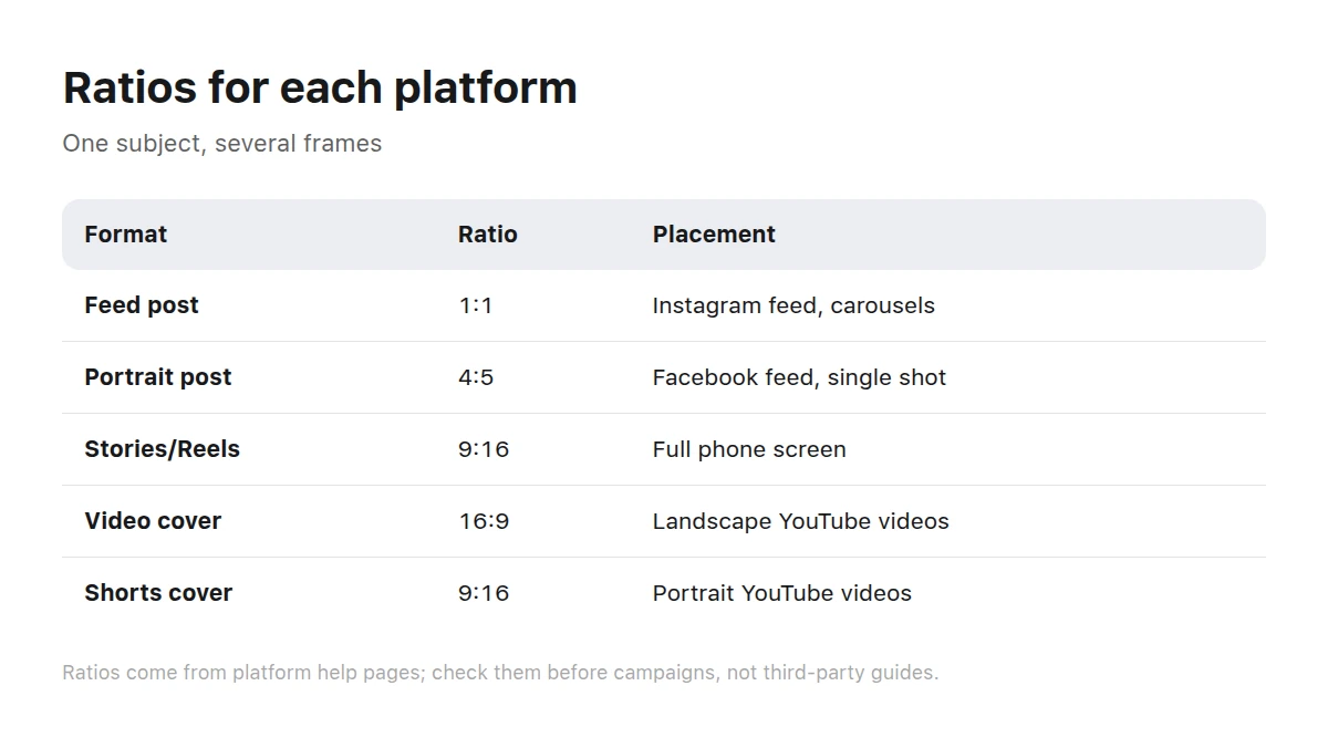
Platform requirements give each social format its own aspect-ratio frame.
Why does the same shot look different across feeds?
Because feeds do not show the image; they show a rectangle cut from it. The ratios published in platform help pages are a list of those rectangles.
- Instagram keeps a photo at its original ratio when it is 320 to 1080 pixels wide and between 1.91:1 and 3:4 (at width 1080, that means height from 566 to 1440 pixels); anything outside that range is cropped to a supported ratio (Instagram Help).
- Reels accept ratios from 1.91:1 to 9:16, resolution of at least 720 pixels, and at least 30 frames per second, while the recommended cover is 420 × 654 (Instagram Help).
- Meta placements support 1:1 and 4:5 in feeds: portrait 4:5 is recommended for a single Facebook feed image and square 1:1 for Instagram feed; Stories and Reels use 9:16; carousel cards use the same 1:1 or 4:5 ratio throughout (Meta for Business).
- YouTube requests 16:9 thumbnails for regular videos and 9:16 for Shorts, recommends 3840 × 2160 (and 2160 × 3840 for Shorts), a minimum side of 640 pixels, and JPG or PNG (YouTube Help).
- TikTok creative requirements prefer portrait 9:16 (at least 540 × 960), while accepting square 1:1 from 640 × 640 and landscape 16:9 from 960 × 540 (TikTok Ads Help).
Platform requirements are a lower limit, not a recipe. A shot created at the minimum may survive publication but not reposting because compression accumulates.
What are safe zones and where are they?
A safe zone is the part of the frame guaranteed not to be covered by interface elements: buttons, captions, avatars, and counters. In portrait formats the interface occupies the bottom and right, in feeds the lower edge, and in previews the lower-right corner where the timecode appears.
Check text inside the shot separately. Lettering in the bottom tenth of a portrait frame will almost certainly sit under a caption or button. Everyone notices except the author who reviewed the layout without the interface.
One shot for every platform or one for each?
One shot for all
Cheap, fast, and easy to keep recognizable. It requires broad margins and a strictly centered subject. It loses when the format itself carries meaning: a landscape shot inside full-screen portrait content looks like someone else’s repost.
One shot for each
Every feed gets a composition made for its ratio: height works in portrait and the center works in square. Selection costs more, but the post does not look transplanted. A sensible compromise is one treatment across different shots from a series, not one shot forced into every frame.
How can you build a set instead of chasing posts?
A set is several shots in one treatment that cover a week or campaign. Building it in a batch is faster and cheaper than finding each post separately.
List the posts
Start with topics and formats: what goes to the feed, portrait, and video cover. The list determines how many ratios you need.
Choose an anchor shot
Find one shot you definitely like that definitely fits the main post. It sets the treatment: light, camera angle, and detail density.
Add neighbors in the same treatment
Look for works from the same brief or category. Their shared brief makes the set look shot in one day, not assembled across a catalog.
Crop for every format
Prepare all required ratios immediately, not at publication. Rushed cropping is the main source of cut-off heads and missing captions.
Review it in the feed
View the set as readers will: a grid of small previews. At this scale you can see the rhythm and the one shot that falls out.
What creates feed rhythm?
Recognition. A feed is read as several consecutive posts, so alternation matters more than one shot: close-up, wide shot, object, then close-up again. Consistent light temperature and treatment make a profile look intentional rather than like an uploads folder.
LifestyleEveryday scenes form the bulk of most posts and are easiest to keep in a consistent treatment.
Food and drinks demand the most careful lighting and perform especially well in square feeds.
Clothing and looks benefit from portrait shots where height supports the composition rather than going to waste.
For seasonal occasions, select from holidays in advance; for active formats and sporting events, use sport. In both cases, gathering material before publication week beats searching on the day.
What should you check before publishing?
- The ratio matches exactly what the platform expects, not something “close enough.”
- The subject survives cropping in every destination format.
- Text and logos remain inside the safe zone.
- The shot reads in a small, coin-sized profile-grid preview.
- The set looks like one visual voice rather than a collection of finds.
For selecting and inspecting a shot, see how to choose an AI image. If the material will also appear on a page, read images for websites and landing pages; for paid traffic, see ad creatives that work.
Browse further subject options in the catalog.
Key takeaways
- Feeds show a rectangle cut from an image, so geometry matters before subject.
- Take ratios from platform help pages, not third-party cheat sheets; they change.
- Keep meaning centered and leave room at the edges so the shot survives every crop.
- Build the set as a series and crop in advance, not at publication.
- Alternating shot scales under consistent lighting creates feed rhythm.
Which aspect ratio is most universal?
Square 1:1 survives the most crops but occupies less space in portrait feeds. For one format, use square; for many posts, a portrait shot with broad margins offers more options.
Can I publish a landscape shot in a portrait feed?
Yes, but it occupies a strip across the middle, and the platform may add a background around it. In Stories and short videos that noticeably loses attention; a full-screen shot performs better.
What should I do with text on an image?
Keep it large and near the center. Small lettering is unreadable in a feed and is covered by the interface first. Put long text in the post caption rather than over the shot.
Do videos need separate covers?
Yes, if the platform displays them. YouTube asks for 16:9 on regular videos and 9:16 on Shorts. Those are different frames, and one cover will always crop badly somewhere.
How many images are needed for a week?
One for each planned post, plus one or two backup shots in the same treatment. The backup is for replacement, not volume: a subject may become inappropriate by publication day.
How can I tell whether the feed looks inconsistent?
View the profile as a grid of small previews and squint. If your eye catches on a shot with different light temperature or detail density, that is the outlier.
What should I do with old posts after changing the visual treatment?
Do not remake them. Start the new series and let it build volume. People read from the top, and after a dozen posts the new treatment becomes dominant by itself.