In short
A page does not have one image but five or six slots with different requirements. A hero needs room for the headline and a small file, a product block needs a concrete product shot, a trust block needs people, a background needs a calm surface, and a link preview needs its own landscape shot. They cannot all be selected alike: each slot has its own size, ratio, and cost of failure.
A landing page is often assembled by finding one striking hero and filling the other slots with “something similar.” A month later, it looks like a collage from different sources, loads longer than necessary, and expands into a gray rectangle in messengers. Let us break the page into slots and see what each requires.
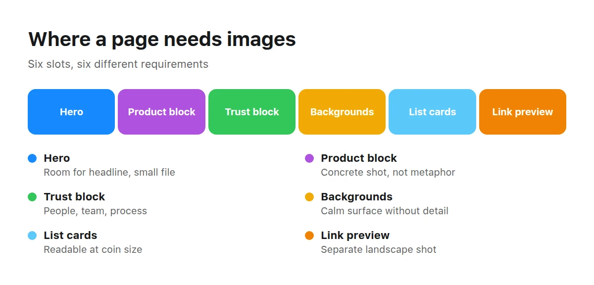
A typical page has six image placements, each with different requirements.
Which places on a page actually need an image?
Usually six, and they are not interchangeable.
- Hero. The page’s most expensive image: everyone sees it, it sets the tone, and it is usually the heaviest loading element.
- Product block. Shows the object or interface. It must be honest because readers compare the promise with what they see.
- Trust block. People, team, process, or customers. It works through recognition rather than beauty.
- Backgrounds and dividers. Calm surfaces between content blocks; their job is not to interfere.
- List cards. Small shots that remain readable at coin size.
- Link preview. The shot people see in a messenger or social network before opening the page.
What should a hero image be like?
Calm around the edges and light in file weight. The hero usually contains the page’s largest element, used to measure Largest Contentful Paint. Google recommends keeping LCP within 2.5 seconds at the 75th percentile of page loads (web.dev). A heavy hero image is the easiest way to exceed that threshold.
This leads to practical requirements:
- Room for the headline. An even area without important details where text and a button can sit.
- Simple composition. One focal point. A complex hero competes with the headline and weakens both messages.
- Tolerance for cropping. On mobile, only the center of a landscape frame remains, and the subject must survive there.
- Ability to compress. At equal quality, soft gradients and fewer small details weigh far less than busy imagery.
Full-width shot or image in a column?
Both work. Choose according to what matters more in the block: atmosphere or explanation.
Full-width shot
Creates atmosphere and makes a page feel more premium. It needs generous margins: a wide monitor shows the center, and a phone shows an even narrower center. Small details and text inside the shot crop badly. It costs more in file weight and usually affects loading-speed measurement.
Image in a column
Sits beside and explains the text. Its ratio is stable, cropping predictable, and file weight lower. Fine details are acceptable because readers view it closely. It provides less “wow,” but does not obstruct reading and can be replaced without rebuilding the block.
What belongs in product, service, and trust blocks?
Here the image answers “what will I get?” and “whom can I trust?” Concrete scenes work better than abstraction.
MockupsMockups and product scenes show an app, package, or printed material as if it already existed.
Work, negotiations, and teams fill About blocks and service pages.
Rooms and workspaces help when a service happens offline, from a studio to a clinic.
The logic is the same for real estate agencies, using real estate. Abstract surfaces suit dividers and backgrounds because they do not compete with text and adapt easily to brand colors. For benefit lists, it is easier to use icons than draw them from scratch.
How should you prepare a file without making the page heavy?
The sequence is the same for every page slot.
Crop for the slot
Crop to the block’s ratio before anything else. A browser-cropped image still loads in full, so you pay for pixels nobody sees.
Set the real dimensions
The image width should match its displayed width, allowing for double-density screens—not “four thousand pixels just in case.”
Compress and compare
Save in a modern format and compare it with the original at display size. Any difference invisible at that size is pure savings.
Defer images below the fold
Everything below the hero loads lazily. The hero itself must not: lazy-loading it deliberately slows the page’s main metric.
Check on a phone
Open the page on mobile and see what remains after every crop and how long the hero takes to appear.
What will people see in the link preview?
A separate image specified with the og:image tag. Meta recommends at least 1200 × 630 pixels, permits a minimum of 200 × 200 and a file up to 8 MB, and advises a ratio close to 1.91:1 or the shot may be cropped (Meta developer documentation). An image smaller than 600 × 315 appears as a small square beside the link—the “gray rectangle” that spoils a campaign.
What should you write in alt text?
Describe what is visible, briefly and directly. Screen readers and search crawlers use alt text. Google’s image guidelines recommend descriptive text rather than keyword lists and note that meaningful filenames and nearby captions also clarify content (Google Search Central).
A practical rule: describe the shot as you would over the phone to someone making a decision. “A barista prepares coffee behind the counter” is better than “coffee, coffee shop, barista, espresso, buy coffee.”
How do you build a page set rather than a collection of finds?
Look at the whole page, not one block at a time. Shots on one page should share three qualities: light temperature, camera angle, and detail density. This is easiest with images from the same brief or catalog category, where the shared treatment is built into the brief.
How to choose an AI image explains selection and pre-purchase checks. If the page becomes posts, read about images for social media; if you send paid traffic to it, see ad creatives that work.
Key takeaways
- A page has six image placements with different requirements, not one generic image.
- The hero usually determines loading speed: do not lazy-load it or keep it oversized “just in case.”
- The slot sets the ratio, not the source: crop before upload, not in the browser.
- Select the link preview separately according to platform requirements.
- Alt text describes content; a decorative background remains undescribed.
How many images does a landing page need?
As many as there are content blocks that require showing something, usually four to eight. An image without a job adds weight and noise; a block without an image when readers need to see an object loses an explanation.
Can the hero and link preview use the same shot?
Yes, if it survives both ratios and remains clear at small size. Two shots from one series are often better because previews have a different reading scale.
How wide should a hero image be?
The displayed width multiplied by screen density, and no more. There is no universal number: a 720-pixel column and a full-width hero require different answers.
What if a shot is beautiful but busy?
Use it where no text sits over it: a product block, gallery, or divider. A hero needs an area without details, either in another shot or a calmer version of the same scene.
Do images on a page need captions?
Use a caption where the shot contains data or needs explanation: diagrams, comparisons, and interfaces. A decorative illustration needs none because it steals attention from the headline.
How can I tell whether images slow the page?
Measure when the largest element appears on a mobile connection and identify that element. If it is the hero, optimize it before scripts.
What can replace a photograph if the product does not exist yet?
Use a mockup or process illustration. A photorealistic nonexistent product is risky: a promise that fails to match reality costs more than a missing image.