In short
Selection starts not with the image but with the place it will occupy: size, aspect ratio, overlaid text, and neighboring shots. Then come three checks: the subject supports the message, details hold up at the required scale, and the visual treatment can be repeated across a series. The process is the same for an article cover, a landing-page hero, and a product card. Everything else is personal taste that may later break the layout.
A catalog of generated images will always contain more beautiful shots than suitable ones. That is why choosing takes so long: the eye judges an image on its own, while the image must work in someone else’s setting, beside a headline, button, and neighboring visuals. The process below turns “I like it” into “it fits”: describe the slot first, then search, then check.
Should you start with the task or the image?
Start with the task. Until the slot is defined, every attractive find looks suitable because there is nothing to compare it with. A five-line description can save an hour of browsing.
- Where it appears — an article cover, landing-page hero, product card, or feed post.
- How large it appears — full screen width or as a coin-sized square in a list.
- Which aspect ratio — landscape, square, or portrait.
- What goes over it — a headline, button, logo, caption, or nothing.
- What sits beside it — neighboring shots in the same block and row.
The last point is forgotten most often, yet it determines half the decisions. A standalone shot can be chosen to taste; a shot in a row must agree with its neighbors in lighting, density, and camera angle.
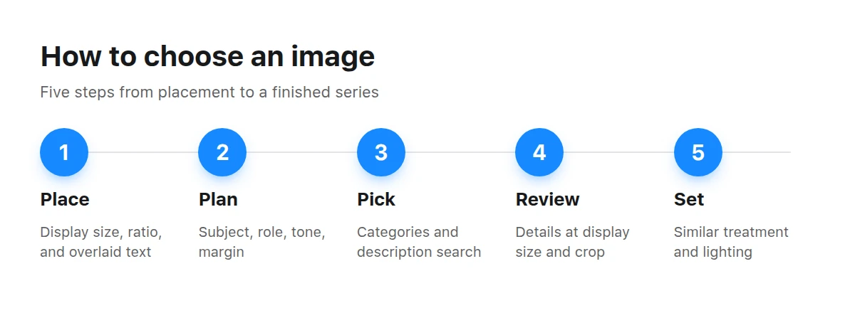
The complete method runs from defining the placement to building a consistent series.
What should a search brief contain?
A search brief is not a list of attractive words. It translates the slot description into visible properties of the shot. It answers “what should be visible?” rather than “what style should it have?”
- Subject. What is happening: a person works, a product stands on a table, or a city is seen from above. Subject comes first; style follows.
- Role in the layout. An illustration explains, a background supports text, and a hero creates the first impression. A background has the opposite requirements from a hero: the calmer, the better.
- Orientation and margin. Landscape for a header, portrait for mobile, square for a feed, plus room around the edges for cropping.
- Tone. Warm or cool, daytime or evening, light or high-contrast. Tone is easier to define than “style” and easier to check by eye.
- Series. Do you need one image or a set? If it is a set, search for the set immediately rather than choosing one and hoping to find something similar later.
With this brief, the catalog stops being an endless feed. Category filters remove irrelevant work, while words from titles and descriptions find a subject rather than a mood.
How can you tell whether a shot will hold up when enlarged?
The weak points of generated images hide in small details, and enlargement reveals all of them. Open the work page and inspect it at the size your reader will see.
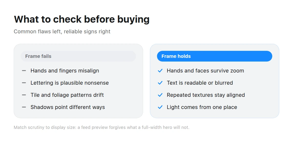
Check hands, lettering, repeated textures, shadows, and object boundaries before anything else.
- Hands, fingers, and jewelry. The most common and visible failure: a reader spots it before reading the headline.
- Writing and signs. Neural networks confidently draw plausible nonsense. Text must either be readable and meaningful or intentionally blurred.
- Repeated textures. In tile, brick, foliage, fabric, and crowds, look for places where the pattern breaks or drifts.
- Shadows and reflections. Light should come from one place. A shadow pointing the wrong way undermines trust even when a viewer cannot explain why.
- Object boundaries. Hair against a background, the rim of glasses, a cup handle, or a chair leg—where one object ends and another begins.
Match the strictness of the check to display size. A flaw where hair meets the background may not matter in a coin-sized preview; in a full-width hero, it certainly will.
Photorealism or illustration: which fits the task?
Both work. The choice depends not on taste but on what should happen in the reader’s mind.
Photorealism
Works where trust and recognition matter: product cards, service pages, people, testimonials, and documentary scenes. It demands strict detail checks because the eye compares it with reality and notices fakery. It is less tolerant of overlaid text because photographs rarely provide truly empty space.
Illustration
Works when explaining something abstract: pricing, security, a process, or an idea. It tolerates liberties in detail, adapts easily to brand colors, and readily leaves room for a headline. It is weaker at selling a physical product: a drawing cannot replace seeing the item.
You can mix the approaches deliberately—for example, photorealism in a product block and illustration in a process block. Random alternation looks careless.
How can you check a shot in two minutes?
A short pre-purchase check catches nearly every frustrating mistake. You need no editor, only the work page and your layout.
View it at display size
Reduce the image to the size people will see. Half your doubts disappear: some flaws vanish in a feed, while details that seemed minor become obvious in a hero.
Find every text surface
Scan every sign, laptop screen, package, and T-shirt. Decide whether the text is readable or must be covered by a layout element.
Check light and geometry
One light source, shadows in one direction, upright verticals, and reflections matching the scene. It is faster than it sounds: once you look, inconsistencies stand out.
Test the crop
Crop the shot mentally to every required aspect ratio. If the subject moves beyond the edge in a square crop, the shot is unsuitable—or suitable for only one slot.
Where should you leave room for text?
Wherever the layout places a headline or button. “Room” means an area without important details or abrupt brightness changes: white text reads on a smooth dark area and disappears on a busy one.
If one shot will appear in several places with different ratios, that room must survive every crop. See images for social media for feed and portrait crops, and images for websites and landing pages for the different constraints of site layouts.
One image or a series?
With one image on a page, mistakes are difficult. With three or more, the quality of each shot matters less than consistency across the set: similar camera angles, light temperature, and detail density.
BusinessWork and team scenes—negotiations, workplaces, and meetings—often provide a complete set for an About page.
Close portraits demand the strictest checking and have the strongest effect when chosen well.
Screens, interfaces, and equipment suit articles about products and processes.
For backgrounds, choose calm surfaces from textures that do not compete with text. For atmosphere, nature makes it easier to find shots with a ready-made open area for a headline.
What most often goes wrong?
Another nearly invisible mistake is choosing only for today’s task. A hero shot almost always travels later to a link preview, email, and post. If it works in only one ratio, you will discover that when there is no time left to search.
Read ad creatives that work before adapting the same image for paid placements.
Key takeaways
- Define the placement first: display size, ratio, overlaid text, and neighboring shots.
- Subject matters more than style: a prettier but approximate image loses to a precise one.
- Check details at display size, not inspection size.
- Find natural room for text instead of creating it with an overlay.
- Build the set at once: a consistent treatment matters more than one exceptional shot.
Where do I start if the task is not yet defined?
Write one sentence describing what the reader should understand from the image. It determines the subject and role in the layout, which then determine ratio, tone, and room for text.
How do I know a shot will not hold up at a large size?
Enlarge it to its intended display size and inspect hands, writing, repeated textures, and object boundaries. If you have to persuade yourself that “nobody will notice in the layout,” they will.
Can I use one shot in several places?
Yes, if it survives every required crop. Check beforehand that the subject does not disappear when switching from landscape to square and portrait.
What if the shot contains text in an unknown language?
Treat it as decoration and cover it with a layout element, or choose another shot. Plausible but meaningless lettering is one of the clearest signs of careless selection.
How can I build a series when suitable shots are scarce?
Look for works from one brief or catalog category. A shared brief gives them closer lighting and treatment than random finds. A mixed-source series will need color correction.
Which matters more, resolution or subject?
Subject. Low resolution limits display size, but no resolution can rescue the wrong subject: readers understand the shot’s meaning before judging its quality.