In short
An ad shot has one job: stop the scroll and communicate a promise in a fraction of a second. Choose it not for beauty but for readability at small size, room for text, and compatibility with platform formats. Then test a batch, watch your own figures, and replace the shot before it stops working.
An article illustration can be subtle because the reader has time to study it. An ad shot has none: it competes with feed content, not neighboring banners. That explains every difference—selection, margin around the edges, and replacement frequency.
How does an ad creative differ from an illustration?
In three ways.
- Reading speed. The subject must read at preview size without a caption. A simple advertising scene almost always beats a complex one.
- Room for text. A creative usually includes a headline, and it needs somewhere to sit. A shot without an empty area works only where text appears outside the image.
- Lifespan. An article illustration lasts for years; a creative lasts until the audience has seen too much of it. Plan replacements in advance rather than after performance drops.
Which formats do advertising platforms require?
Requirements are published in ad-account help pages, the only reliable source because placement sets change faster than third-party cheat sheets.
Google lists these images for responsive display ads (Google Ads Help):
| Asset | Aspect ratio | Recommended size | Minimum |
|---|---|---|---|
| Landscape | 1.91:1 | 1200 × 628 | 600 × 314 |
| Square | 1:1 | 600 × 600 | 300 × 300 |
| Logo | 1:1 | 1200 × 1200 | 128 × 128 |
| Logo | 4:1 | 1200 × 300 | 512 × 128 |
The same page lists text limits: up to 30 characters for a headline, up to 90 for a long headline and description, and up to 25 for the business name. This affects image selection: the shorter the permitted headline, the more the image must explain.
Meta recommends choosing by placement: feeds support 1:1 and 4:5 (4:5 is recommended for a single image in the Facebook feed and 1:1 in the Instagram feed), Stories and Reels use 9:16, and all carousel cards use the same 1:1 or 4:5 ratio (Meta for Business). TikTok prefers portrait 9:16 while accepting 1:1 and 16:9 (TikTok Ads Help).
The practical conclusion is that one campaign almost always needs at least three ratios: landscape, square, and portrait. Choose a shot with room around the edges, or those three ratios become three different subjects.
How do you build a batch of creatives to test?
One creative tests nothing because it has no comparison. Test a set whose variants differ in one quality at a time.
Fix the promise
Begin with one sentence stating what the person receives. Every creative in the batch says the same thing, or you are comparing different offers rather than images.
Use different shot types
Product close-up, person with product, outcome of use, abstraction, or metaphor. These are four hypotheses about what catches your audience.
Use one text
Give every variant the same headline. Different copy on different images turns the test into a mixture from which no conclusion follows.
Crop for placements
Prepare every variant in every required ratio while keeping the subject intact. Skip a format and the platform crops it itself, not where you would.
Agree on the replacement rule
Before launch, decide what change in your own metrics will turn a variant off. A rule invented afterward is always adjusted to the result you wanted.
What is creative fatigue and how can you spot it?
Fatigue is when a creative stops producing its previous result under unchanged settings because the audience has seen it too often. There are no universal figures: the pace depends on audience size, budget, and impression frequency. Watch your own account’s trend, not someone else’s “market average.”
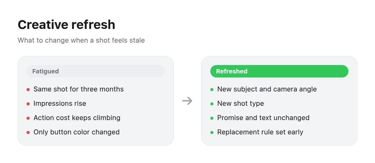
When refreshing, change the subject and composition before changing the button color.
Watch three things: how cost per target action changes under the same settings, how impressions per person increase, and how click share moves relative to the first days of delivery. If all three move in one direction, the creative rather than the bids is responsible.
Refresh the shot
This helps when the promise remains valid but the image is overfamiliar. Change the subject, camera angle, person, or time of day—things visible at first glance. Tiny changes such as a new background shade do not count because audiences recognize composition.
Change the promise
Do this when new shots produce the same result. The message rather than the creative is exhausted: the audience heard it and did not respond. Change the offer, argument, or segment, then choose an image for the new promise.
What should you check before launch?
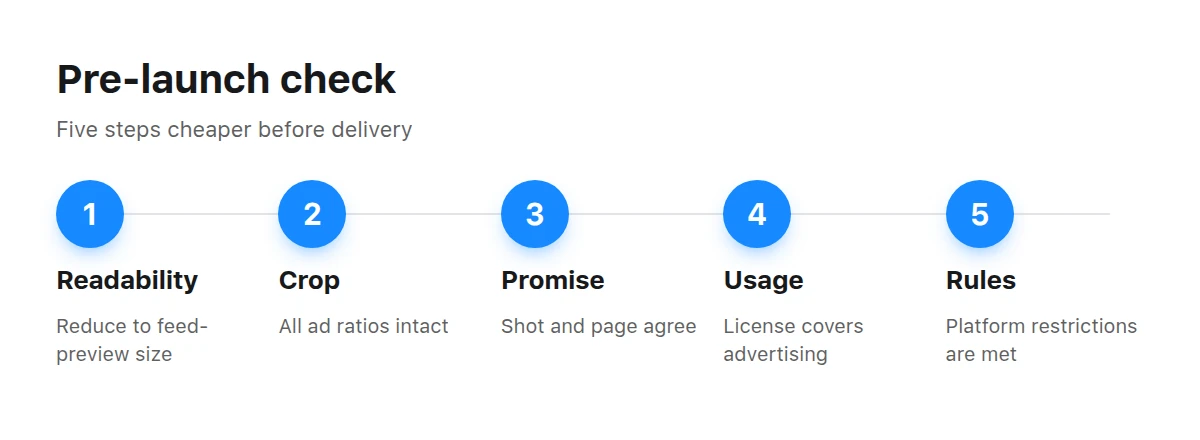
The five-step pre-launch check is cheaper than fixing a campaign during delivery.
- Readability at small size. Reduce the creative to feed-preview size: the subject must remain clear and the text legible.
- Integrity after cropping. Check the shot in every campaign ratio.
- Match with the promise. The image must not promise what the landing page lacks; a mismatch destroys conversion immediately after the click.
- Usage rights. Ensure the license covers advertising and the selected platforms; our rules are on the Terms page.
- Platform rules. Nearly every platform restricts imagery, from the amount of text to prohibited subjects in areas such as finance and medicine.
Where can you find shots for your subject?
FinanceMoney, payments, and analytics: restrained scenes that do not clash with restrictions in financial advertising.
Cars and roads provide strong landscape shots that usually leave room for text.
Care and beauty offer close-ups and textures readable even in a small preview.
For games and entertainment offers, browse gaming; for delivery, cafés, and beverages, use drinks. Both contain shots in treatments familiar from their respective feeds. More options are in the catalog.
For choosing and checking the shot itself, read how to choose an AI image. For the landing page behind the ad, see images for websites and landing pages. For feed formats when traffic comes from social networks, see images for social media.
Key takeaways
- Choose an ad shot for reading speed, not beauty.
- Take ratios from ad-platform help pages; campaigns usually need landscape, square, and portrait.
- Test a batch with one promise and one text, changing only the shot type.
- Read fatigue in your own trend, not someone else’s average figures.
- Pre-launch checks are cheaper than live fixes: size, crop, promise, rights, and platform rules.
How many creatives do I need at launch?
As many as the image hypotheses you can test, usually three or four shot types with one promise and one text. With fewer there is nothing to compare; with more, the budget spreads too thinly for any variant to gather data.
How often should creatives be changed?
Follow your own data, not the calendar. Watch cost per target action under unchanged settings and impression frequency. When both rise, refresh the shot.
Does one image work for every platform?
Only with generous margins and a centered subject. It is usually better to prepare one subject in three ratios than stretch one file across all placements.
Can generated people appear in ads?
Yes, as illustrations. Do not present them as real customers, employees, or testimonial authors: that would assert a fact that never happened.
What if the creative fails from day one?
Check the entire chain: promise, shot, copy, and landing page. Often the problem is not the image but a mismatch between the creative’s promise and what people see after clicking.
Does text over the image help?
Yes, when it is short and placed in an empty area. A long line in small type is unreadable in the feed and takes space from the subject, which works before the text can be read.
How do I know whether the creative rather than the audience is at fault?
Run the old and new shots for the same audience under identical settings. A difference points to the shot; if both perform equally poorly, change the promise or segment.