

In short
Software has no photogenic body: there is nothing to shoot, but every screen needs images. A useful technology visual system is not one beautiful illustration. It is a related series: a homepage hero, feature blocks, blog covers, empty states, and emails, all built from images made around the same subject and visual direction.
A SaaS website has an unfair job: it must explain something invisible in the same space an online shoe shop gets. That leads to two extremes — lifeless full-width interface screenshots and generic stock “hands over a laptop.” Here is the middle ground: a set that explains the product and keeps one visual language from the homepage to the footer of an email.
What can you illustrate when the product is software?
Illustrate the job it does and the world where that job happens, not the product itself. Users buy an outcome, not an interface: an on-time report, accurate warehouse stock, or a calm release. An image shows the outcome and context; a screenshot shows the mechanics. They work together, not alone.
That leaves three honest sources of imagery for a technology product:
- abstraction — nodes, flows, layers, and grids that suggest how a system works;
- setting — workplaces, server rooms, warehouses, and workshops where the product is used;
- object-led scenes — devices, screens, and equipment without a visible interface.
Screenshots remain screenshots. They belong beside a feature description, not as decoration.
What makes up a product visual set?
It consists of six recurring placements, each with a different job.
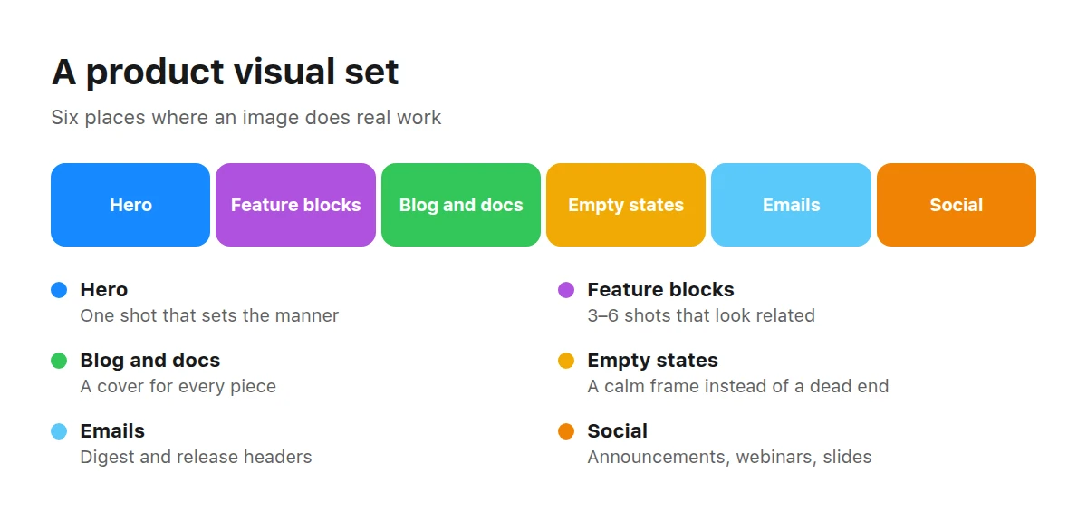
The set is assembled once and then grows one image at a time.
Homepage hero. One image that carries the product’s central idea. It gets the most attention and establishes the visual language for everything else.
Feature blocks. Three to six smaller images that need to feel related. Consistency matters most here; a mixed set looks pulled from random searches.
Blog and documentation covers. You always need more than expected because every article wants its own.
Empty states and errors. A screen without data is when a user is closest to leaving. A calm illustration is more helpful than a sad face.
Emails and notifications. Email headers, digest images, and release covers.
Social media and conferences. Announcements, webinar covers, slides, and booth graphics.
How can you show the invisible without drawing a diagram?
Use three techniques that work for almost any technical product.
Show the input and output. Every system receives something and produces something: warehouse boxes and a dispatch note, a call and its transcript, a draft and a signed document. A before-and-after image explains the product faster than a generic abstraction, and the objects — not the software — are what you shoot.
Show the workplace. Logistics fits warehouses and loading bays; fintech, checkouts and branches; industrial software, workshops and control rooms. Industry context immediately tells the right visitor, “This is for us,” while filtering out the wrong audience.
Show scale. One device and a rack of devices communicate different things. If the product handles volume, the image should show multiplicity through rows, grids, and repetition.
Abstraction is the fourth option, with one condition: build it from the forms of your interface — the same corner radius, palette, and line weight. Generic abstraction is indistinguishable from a desktop wallpaper.
What does a cliché look like, and what should replace it?
A cliché is an image that could sit on any competitor’s website without changing a word. Its replacement is always more specific.
Worn out
- Hands over a laptop in a meeting room
- A blue “digital brain” or neural network made of dots
- A padlock over binary code
- A handshake beside an upward graph
- A robot with a human face
Effective
- The actual workplace of the person using the product
- A data flow represented as a physical object
- A server room, warehouse, workshop, or cabin relevant to the task
- A close-up of equipment a person works with
- An abstraction made from the product’s brand shapes
The test is simple: put a competitor’s name under the image. If it still fits, you have a cliché.
What technical requirements do web images need to meet?
Layout, not taste, sets the rules: an image must survive cropping, dark mode, and a mobile screen.
Checklist before adding an image to a website
- Use 16:9 landscape for heroes and covers, and square images for feature cards.
- Keep the longest side at 1600 pixels or more so retina screens stay sharp.
- Make sure edge cropping does not remove the meaning; keep key content at least 8% from the frame.
- Leave a quiet area for the heading and button, away from faces and busy patterns.
- Check the image in dark mode; avoid a solid white background across the whole frame.
- Compress to hundreds of kilobytes, not megabytes, using WebP or AVIF.
- Remove third-party logos, recognisable interfaces, and imitations of familiar brands.
- Keep text out of the image so it does not need to be remade for every language.
What jobs can a ready-made image handle?
Product teams commonly come to the catalogue with five tasks.
A new feature landing page
One hero and three or four feature images, selected from the same brief so the page feels coherent.
Blog and email
A cover for every article. A series gives each edition a shared look, helping subscribers recognise the email before reading the subject line.
Documentation and training
Quiet abstractions and diagram backdrops that leave room for text.
Empty states in the interface
Small, light, and undramatic. The image should help explain what to do next.
An investor deck or conference
Large images of settings and equipment, slides in one style, and booth graphics.
Technology: devices, screens, equipment, and workplaces — the tangible base of a technology product’s visual system.
Abstract: flows, grids, layers, and gradients for diagrams, backdrops, and empty states.
Icons: small symbols for feature blocks and capability lists.
Mockups and templates: devices and screens ready to hold a product screenshot.
If the scene is missing, browse the full catalogue; search covers the title and description of every work.
How can you keep one visual language across many images?
Agree on three parameters and keep them fixed: light, palette, and shot scale.
Light. Choose one direction and temperature, such as warm side light or cool diffused light. Mixing them exposes a patchwork faster than differing subjects.
Palette. Keep two or three product colours and one accent. Any image whose accent fights the website button will need replacing.
Shot scale. Use a wide shot for the hero, medium shots for feature blocks, and close-ups for icon-like illustrations. If everything uses the same scale, the page feels flat.
Agree on storage too. The set will outlive teams: keep source files together, name them for their site placement rather than their subject (“hero-main,” “feature-sync”), and record the brief or scene behind each image. Six months later, that is the only reliable way to add a seventh image matching the first six.
What should you do if the right image does not exist?
Build your own. An abstraction for a specific diagram or a setting for a niche industry is a common gap. Cold-chain logistics software, metal intake, or a power-grid control room are unlikely to exist as ready-made stock scenes because they are expensive to photograph and serve a narrow audience.
Another common case appears six months later, when an established set needs a seventh image in the same style. Finding “the same, but different” on another library is nearly impossible. Describing the accepted visual language and generating the next part of the series takes minutes.
Related reading: marketplace image requirements, ways to show money and work without clichés, and how to build travel visuals without the trip.
Should the homepage use screenshots or illustrations?
Both, in different places. An illustration answers “why,” while a screenshot answers “what does it look like?” A hero usually works better as an illustration; a feature block benefits from a labelled screenshot.
What should I do about dark mode?
Test the image in both themes before buying it. Images without an edge-to-edge white background are the most flexible across light and dark pages.
How many images does a product need at launch?
Six to eight is usually enough: one hero, three or four feature blocks, a blog cover, and an empty state. Add new images as new content appears.
Can 3D, photography, and flat graphics be mixed?
Yes, if each has a stable role — for example, 3D for heroes, photography for settings, and flat graphics for diagrams. Random mixing looks like a lack of design direction.
What about logos of well-known services in the image?
Do not use them. Third-party trademarks create legal risk and may suggest a partnership that does not exist.
How can an early-stage team avoid overspending on visuals?
Start with one hero and three related feature images, then expand as pages are added. The expensive mistake is commissioning twenty images before the site’s story is clear.