
In short
Generation mistakes usually appear where a prompt leaves too many decisions to the model or combines incompatible requirements. Rather than rewriting everything, fix one layer at a time: subject, action, setting, composition, light or constraints. For hands, faces and lettering, changing the shot size and removing unnecessary fine detail also helps.
Why does the shot look different from what you imagined?
Because the model receives only the conditions you name, not the picture in your head. If you specify “a business meeting in an office” but do not describe the number of people, shot size, their positions or the image’s intended use, all those decisions will be made without you. The result may be plausible, but not what you expected.
It helps to divide a prompt into meaningful parts: the main subject, its action, the setting, composition, light, palette, mood, rendering method and constraints. This prompt anatomy is not meant to produce a long list, but to aid diagnosis. When a shot does not work, you can ask which part is missing or described imprecisely.
Something left unnamed does not necessarily become a mistake. Sometimes the model’s freedom produces a successful variation. The problem begins when an important condition remains undefined: empty space for a headline, a neutral background for a product card, a prominent main subject or the absence of logos.
The more clearly you distinguish these parts, the easier it is to compare variants. In the Picwin mini app, an author does not type a prompt manually: the model offers several texts for the brief, and the author browses and chooses one. The variants differ in shot size and angle, light, palette, mood and shooting style. Understanding the structure helps you see in advance which choice will change the shot.
Why do hands, faces and lettering break?
Small repeating details and text are usually assembled less reliably than large forms. Fingers resemble one another, facial features must maintain exact relative positions, and letters require not just visual similarity but a strict sequence of characters. In a wide shot, these areas receive even less visual attention.
First decide whether the troublesome detail is necessary to the meaning. If the scene is about colleagues talking, there is no need to put intertwined hands in the foreground. You can choose a waist-up portrait, remove a complex gesture or give the hands a simple object without fine detail. For a group, it helps not to demand that every face be large, sharp and turned in a different direction at the same time.
Lettering inside the image is best not treated as a finished text layout. If an exact phrase matters, leave a clean area and add typography in an editor. For a sign in the background, you can request a neutral surface without readable words. This separates image generation from typesetting.
The guide to light, composition and “camera” in a prompt explains in more detail how to control shot size, angle and light direction. Treat these parameters not as technical decoration, but as a way to distribute attention within the image.
PeopleThis section is useful for exploring poses, gestures, facial expressions and interactions between people at different shot sizes.
How do you connect a symptom, its cause and the fix?
Start with what you can see in the image, then look for the nearest unnamed or conflicting condition. Do not dismiss the result with the single word “bad”: a specific symptom almost always points to a specific layer of the setup.
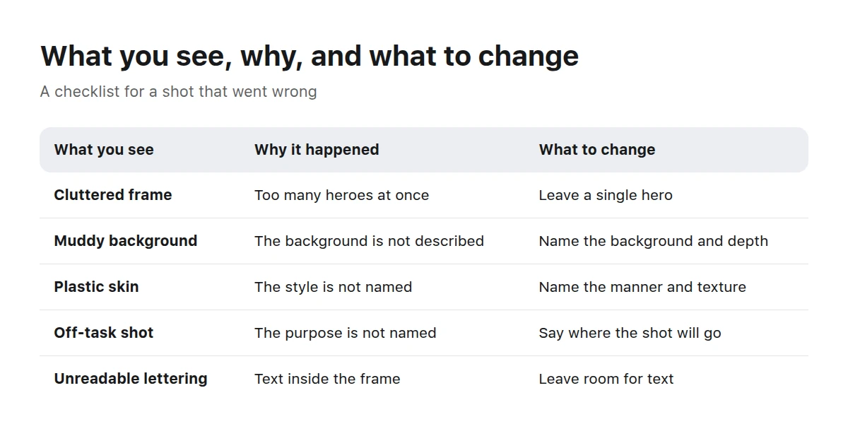
Almost every flaw in a shot traces back to a part of the prompt nobody named.
A cluttered shot. Too many equally important objects compete for attention, actions overlap and the background continues the main story. This is often caused by listing everything you want without a hierarchy. Name one main subject, one action and the role of the remaining elements; set a simple background or an empty area.
A messy background. Random shelves, cables, signs and small decorations appear behind the subject. This means the location was defined too broadly and there is no background requirement. Specify that the background is minimal, visually calm or softly blurred, and list only the environmental details that truly matter.
“Plastic” skin and objects. Surfaces look uniformly smooth, highlights are too even and the material is unreadable. Usually the prompt asks for generic “perfection” without describing texture and light. Instead of an evaluative word, specify matte skin with natural texture, rough ceramics, soft diffused light or restrained highlights—only the traits the scene needs.
The shot is unsuitable for its purpose. The image is attractive on its own, but there is nowhere for a headline, the product is too small, or an editorial scene looks like a catalog. The intended use is missing. Add it: a banner with a clean area on one side, a product card with a central object, or an editorial shot with context.
Extra objects. Additional cups, devices or packages appear on the table. This happens when the setting is described as busy or the role of the props is undefined. Keep a short list of required objects and say the surface is clear; use a prohibition for one critical exception, not for everything imaginable.
The wrong scale. The important object is lost in the interior or, conversely, fills the frame so completely that the context disappears. The shot size, distance or proportion of the setting has not been named. Specify a close-up, medium or wide shot and explain what should remain visible around it.
How can you fix a prompt without rewriting all of it?
Change one meaningful part per attempt and compare the result with the task. A full rewrite changes the story, composition, light and mood at once, so you will not know which edit helped and which created a new problem.
Name the visible defect
Write it down concretely: “the main subject gets lost,” “the background is overloaded,” “the hands cover the face.” Saying “everything looks bad” gives no clue where to look for the cause.
Find the missing part
Check the subject, action, setting, composition, light, texture, purpose and constraints. Start with a part that is entirely absent: adding it is usually clearer than restructuring conditions that are already defined.
Remove the contradiction
If the prompt asks for minimalism and many prominent details at the same time, choose a priority. The same applies to combining a wide shot with a requirement to show the fine texture of a small object.
Change one condition
Add a shot size, simplify the background or change the action, but do not do everything at once. This keeps the relationship between the edit and the new shot clear, even if the result still needs work.
Check the purpose
Ask whether the image can be used where it is intended. A banner needs an area for interface elements or text, a product card needs a clear object, and an article needs understandable context.
Stop before making a list of prohibitions
Keep only the constraints that matter to the brief, such as no logos or no text in the shot. Other problems are better solved with a positive description of the desired scene.
In Picwin, this skill is used when choosing from the suggested text variants. The author sees the brief—the category topic, purpose of the shot and what it must not contain—and then compares different setups. The generation budget, called “power,” affects the model and the detail of the suggestion, but it does not remove the need to choose suitable composition and conditions.
What do overloaded and well-structured prompts look like?
A well-structured prompt is not necessarily shorter: it simply has a priority and compatible conditions. An overloaded variant tries to show every object close up, preserve a broad context, add many moods and control every small detail at once.
Before
A modern business meeting, many people in a beautiful office, everyone smiling and gesturing actively, laptops, phones, documents, cups and plants on the table, a large city outside the window, a close-up of the whole team, a wide interior, dramatic and soft light, space for a headline.
- many equally important details — attention is divided among people, props, the window and the interior;
- a close-up and a wide interior — two scale requirements conflict;
- dramatic and soft light — the character of the lighting is undefined;
- space for a headline — it is named, but its location is not.
After
Three colleagues discuss a layout at a light-coloured table, medium shot, main focus on the woman in the centre, a minimal office background softly blurred, natural side light, calm business atmosphere, clean space on the right for a headline, no logos or readable text.
- three colleagues and one main focus — establish a hierarchy among the people;
- medium shot — balances their gestures with the visible setting;
- softly blurred background and side light — separate the people without unnecessary decoration;
- space on the right — connects the composition to its purpose;
- critical constraints — remove only logos and accidental lettering.
When editing, do not copy someone else’s aesthetic formula or replace a description with an author’s name. It is more useful to name observable traits: a restrained palette, soft shadows, frontal composition, documentary treatment, grainy texture. This approach is discussed in more detail in the guide to styles and references in a prompt.
BusinessIn this section, you can compare how composition supports meetings, work processes, banners and editorial stories.
When is the prompt not the problem?
Sometimes a targeted edit does not help because the task itself is contradictory or demands precision that an image is not expected to reproduce. It is then better to change the setup, divide the work into stages or choose a different subject.
Another reason is the randomness of generation. The same text describes a range of possible solutions, not one predetermined shot. Running it again may produce another pose or background, but it will not fix a systematic gap. If every result is overloaded, add hierarchy and composition instead of restarting endlessly.
What counts as a defect for a stock library?
For a stock library, a defect is not just any unusual detail, but one that prevents the image from being used as intended or violates the setup. Neat faces and objects matter, but so do a readable composition, relevance to the topic and the absence of prohibited elements.
In Picwin, finished work is reviewed, and each task level has its own review strictness. The platform buys an accepted work together with the rights, after which it appears as a card in the stock catalog and can be purchased under licence. Demo mode lets you try the process without money, but demo work is not published and earns no points.
The most common obstacles are artifacts in prominent places: an extra part of the main subject’s hand, a smeared product edge, accidental lettering in the centre. The second type of problem is failure to follow the brief: a text-free product card was required, but the result is an editorial scene with a sign. The third is an unreadable composition where it is unclear what matters and where to look.
It is best to review from the general to the specific. First assess the match with the topic and purpose, then the composition, and afterwards faces, hands, object boundaries, reflections, background and possible lettering. This prevents you from spending time fixing a small defect in a shot that does not meet the task overall.
Key takeaways
- A mistake usually points to a missing, imprecise or contradictory part of the prompt.
- When shot size, background and purpose are unnamed, the model decides them, so the result may differ from expectations.
- Do not make hands, faces and text more complex or prominent than the story requires.
- Fix one meaningful part per attempt so that you understand the effect of the edit.
- A positive description of the desired scene is more useful than a long list of possible defects.
- For stock images, following the brief, readable composition and the absence of visible artifacts are essential.
What else do people ask about generation mistakes?
Why does the same prompt produce different shots?
A prompt defines conditions and a range of solutions rather than fixing one composition. Poses, prop positions, background details and the character of the light can vary if they are not specified in words.
Does simply running generation again help?
Restarting helps produce another variation when the setup is already clear and the problem is random. If the defect keeps recurring in meaning—for example, the background is always overloaded—it is better to change the corresponding part of the prompt.
What should you do with text in an image?
Do not rely on generation if a phrase must be read exactly. Ask for an empty area or a neutral sign without readable characters, then add the text as a separate stage.
What if the hands keep turning out badly?
Change the gesture, shot size or position of the hands relative to the face and objects. If the hands carry no meaning, do not put them in the foreground or complicate the interaction between several people.
Should you list every prohibition?
No. A long list of prohibitions blurs priorities and does not describe the desired scene. Keep the constraints that matter to the task, and define the background, pose and props with positive traits.
When is it better to change the task instead of fixing the prompt?
Changing the task makes sense if its central subject is difficult for you to assess or the chosen setup requires contradictory conditions. In Picwin, you can return to level selection and tap “Find a task” to get another brief from the catalog.
How do you know when an image is ready for review?
Compare it with the brief’s topic, purpose and prohibitions, then inspect the main subject, background and detail edges. If the composition is readable, the conditions are met and there are no visible artifacts, the work is ready to submit, although the final decision still belongs to the review.