
In short
To explain the shot you need, state the image’s purpose, light source and direction, shot size, angle, camera height, background, and space for text or action. Camera terminology is optional: a clear description of the visible effect usually guides the result more precisely than a lens name without context.
Why does light change a shot more than the subject does?
Light determines a subject’s volume, how visible its texture is, where shadows fall, and which mood registers first. The same ceramic teapot can feel homely in soft window light, restrained against an evenly lit studio background, or dramatic under a hard side beam. The subject remains the same, but its visual role changes.
Light also helps explain the image’s purpose. A product card needs a readable outline, controlled highlights, and a clean background. An editorial scene can allow natural variations in brightness and shadows from the surroundings. For a banner, it is important not only to illuminate the main subject but also to leave a calm area where the headline will not get lost.
You can check the basic request structure against Prompt anatomy: light and composition do not work in isolation, but together with the subject, action, setting, and constraints.
What kinds of light are there, and what do they do?
Choose the kind of light according to what should be visible in the frame and the impression you need, not as a decorative adjective. It helps to connect the source immediately with volume, the character of the shadows, and the image’s purpose.
Soft diffused light creates gradual transitions between light and dark areas. Shadows remain, but their edges do not distract from the form. This works for food, portrait scenes, interiors, and objects with delicate textures when a calm mood matters.
Hard directional light produces distinct shadows, bright highlights, and pronounced relief. It makes geometry more active and can add tension. Choose it for a graphic fashion scene, an architectural detail, or an expressive product setup, but state the direction explicitly: from the side, above, or diagonally.
Backlight comes from behind the object or person. It outlines the silhouette and illuminates hair, steam, glass, and translucent materials. The front can become too dark, however, so add “with soft fill from the front” if the details need to remain readable.
Natural golden-hour light means low, warm sunlight, long shadows, and a gentle sense of depth. It suits walking, travel, or nature scenes. Naming the time alone may not be enough: “warm side light” helps prevent accidental flat frontal illumination.
Studio light on a plain background is useful when the surroundings must not compete with the object. It lets you request even exposure, a controlled shadow, and a clear outline. “Studio” does not necessarily mean flat: a side source and soft fill can preserve volume.
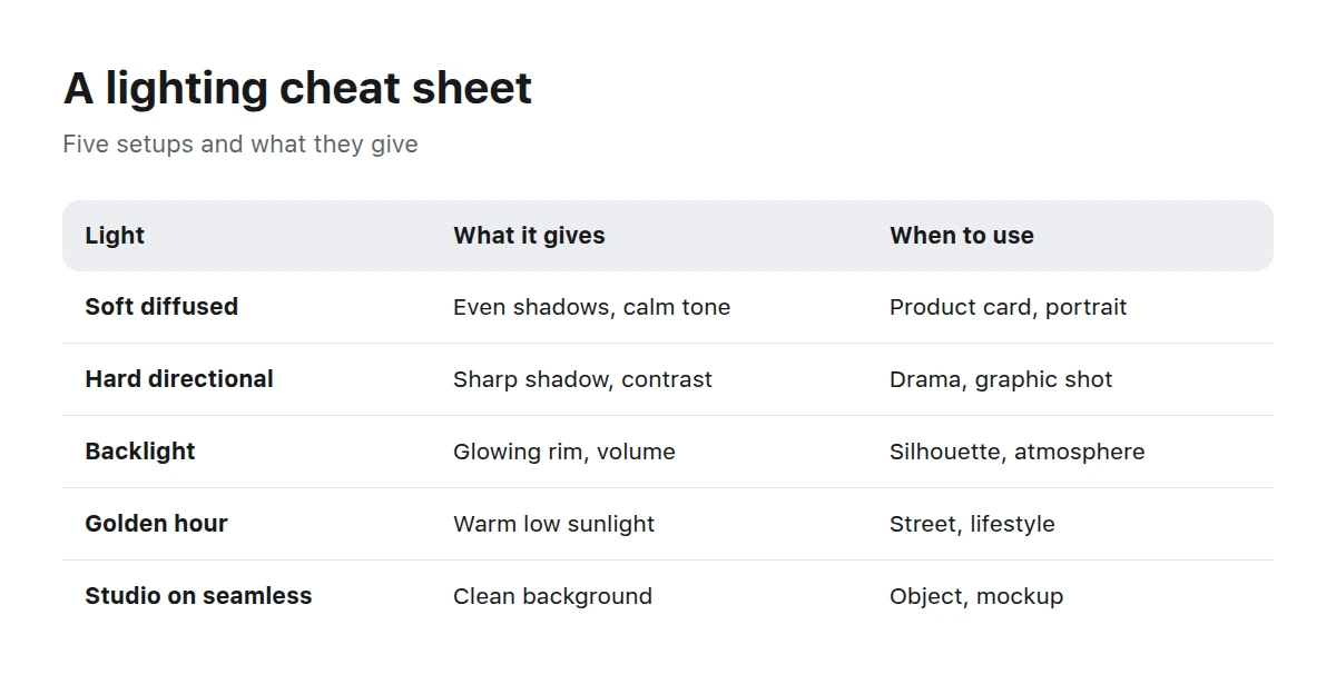
Light is chosen for the job of the shot, not for the nicest name.
Do not mix characteristics without a reason. “Midday sun, soft overcast light, and nighttime backlight” describes several different conditions at once. If the scene genuinely has multiple sources, give each a role: warm key light from a window, weak cool fill from the room.
FoodThe food section shows especially clearly how side light reveals texture and how the chosen angle changes the relationship between a dish and its setting.
How do you describe framing, shot size, angle, and camera height?
A useful sequence is shot size, angle, camera height, position of the main subject, and image ratio. These characteristics answer different questions, so they cannot replace one another.
A wide shot shows a person or object together with the environment. It works when the interior, street, or landscape participates in the story. A medium shot keeps attention on the action while retaining enough context. A close-up shows a face, detail, or texture and makes the surroundings secondary.
The angle tells us from which side the scene is seen. A top-down view helps organize objects on a surface and is often used for arrangements of food, stationery, or cosmetics. Eye level creates the calm presence of an observer. A low angle strengthens the sense of height and monumentality, so use it carefully in a neutral product presentation.
Camera height refines the observer’s position. For example, “slightly above table level” is clearer than simply “from above”: the tabletop will be visible, but the object will retain its side faces. For a person, “at eye level” helps avoid an unintended view from above or below.
The direction of a person’s gaze is tied to composition. If someone looks right, negative space is usually left in front of their gaze rather than behind their head. For a banner, you can write directly: “person in the left third, calm negative space for a headline on the right.” This is more functional than asking for a “beautiful composition.”
Ratios also follow purpose. A wide landscape frame is convenient for a banner, a nearly square one for a product card, and a portrait frame for a mobile feed. Orientation alone is not enough, though: ask to keep important details away from the edges if the image may be adapted to adjacent formats.
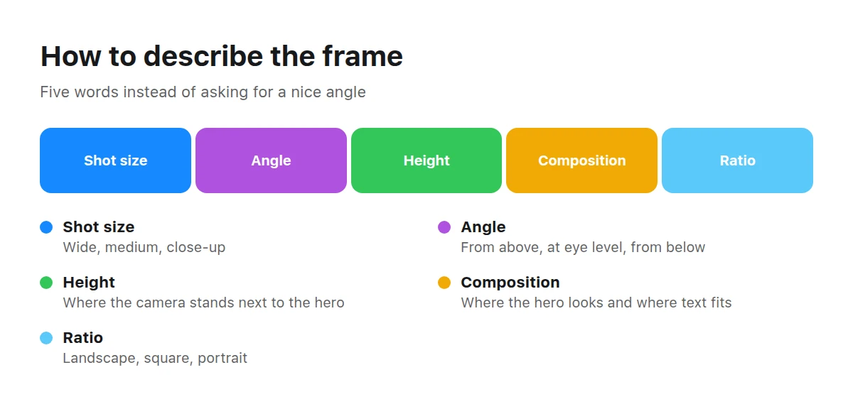
Five words about the frame replace a paragraph about a nice angle.
Do you need words about lenses and cameras?
Lens names, aperture, and shutter speed are optional: for a generator, they more often denote a visual appearance than literal settings on a physical camera. It is therefore more reliable to describe the observable effect: a wide view of the space, compressed perspective, a sharp subject and softly blurred background, frozen movement, or a visible motion trail.
The phrase “wide-angle view” can suggest a spacious interior and exaggerated perspective, but without a camera position it leaves many options. Add “camera at waist height by the entrance, front and side walls visible.” Instead of listing lens settings, say what must stay sharp and how important the background is.
The same applies to “cinematic.” It is too broad: in one shot it can mean low contrast and a restrained palette; in another, backlight, deep shadows, and a wide format. Break the impression down into characteristics. This approach is discussed in more detail in the article about styles and references.
How do you build a lighting setup step by step?
Build a lighting setup from the practical task toward visible details, then check at the end whether any conditions conflict. This order reduces variation because every new decision refines the previous one.
Define the purpose of the shot
First decide where the image will be used: in a banner, product card, article, or brand post. Its purpose tells you whether you need a clean background, room for text, detailed texture, or a lively setting.
Choose the key source and softness
Name the source: a window, the sun, a studio light, or shop-window lighting. Then specify its character—soft and diffused or hard and directional.
Set the direction
Clarify where the key light comes from: the side, front, above, or behind. If you need another source, describe its function, such as gently filling the shadows.
Describe the background and shadows
Say whether the background should be clean, textured, or part of the environment. Define the shadows separately: short or long, soft or sharp, prominent or subdued.
Choose a time of day or a studio
For a natural scene, specify morning, an overcast day, sunset, or night, and connect the time with the direction of light. For a controlled setup, specify a studio environment and background color.
Remove contradictions
Check whether the chosen characteristics can coexist. If you need both deep shadows and readable details, add weak fill; if you need a clean catalog look, remove accidental colored sources.
Before and after — how does the description of one object change?
A specific description moves the request from a general mood to a controlled setup: it becomes clear where the object is, where the light comes from, what the shadow looks like, and why the negative space is there.
Before
Stylish water bottle on a beautiful background, professional lighting, striking angle.
- stylish and beautiful — express an opinion but name no visible characteristics;
- professional lighting — does not explain the source, softness, or direction;
- striking angle — does not set the camera position;
- water bottle — names the object but not the purpose of the shot.
After
Transparent water bottle for a wide banner, medium product shot, camera at bottle height, soft side light from a large window, thin rim of light around the edge, light gray background, bottle on the right, negative space for a headline on the left, short soft shadow.
- for a wide banner — sets the format and function;
- medium product shot — defines the shot size;
- camera at bottle height — fixes the height;
- soft side light from a large window — describes the source and direction;
- thin rim of light around the edge — separates the transparent object from the background;
- bottle on the right, negative space on the left — builds a composition for text;
- short soft shadow — connects the object to the surface.
The “after” version is longer for a reason, not simply to add detail. Each fragment controls a separate visible decision. If a detail does not affect the purpose, light, viewpoint, or readability of the object, it can be removed. If the result adds unwanted objects, confused geometry, or an ambiguous background, consult the guide to common generation mistakes.
How does the shot’s purpose dictate light and composition?
Purpose determines what should dominate and which areas of the image must remain calm. Define the function first, then choose the atmosphere.
A homepage banner usually needs a clear center of attention and a free area for a headline or button. The object can be shifted to one side, the background made less detailed, and the light directed so the eye is not drawn into the text area. Be sure to name the side where the empty space should be.
A product card calls for a readable shape, controlled highlights, a clean background, and a shadow that does not hide the edges. Even soft light often works well, but that does not rule out volume: side lighting helps reveal the material. Choose the camera position so the product’s important sides are not distorted.
An editorial shot for an article can be livelier. The setting, action, natural variation in light, and contextual details all play a part. Yet the composition must still support the topic: the person looks or moves into the open part of the frame, and the background does not steal attention.
In the Picwin mini app, the purpose is already included in the brief. The author chooses a task level and taps “Find a task,” then receives a category topic, the shot’s purpose, and conditions describing what must not appear. Authors do not type prompts manually: the model offers several text variants with different shot sizes, angles, lighting, palettes, moods, and shooting styles, and the author browses them and picks a suitable one.
Understanding light and composition helps authors compare these variants deliberately and anticipate what will change in the frame. The author also sets the generation budget—the “power” that determines the model and how detailed the suggestion is. The finished work is reviewed; the platform buys an accepted work together with the rights, after which it appears as a card in the stock catalog and becomes available under license. Demo mode lets authors try the process without spending money, but demo work is not published and earns no points.
InteriorIn interiors, the direction of light, camera height, and breadth of view determine whether a space reads as coherent and functional.
Key takeaways
- Start with the image’s purpose: it determines the background, format, room for text, and acceptable expressiveness of shadows.
- Describe the source, softness, and direction of light as separate characteristics.
- Set the shot size, angle, and camera height instead of replacing them with “beautiful.”
- Use optical terms as shorthand for a visible effect, and explain that effect in words.
- Connect the position of the person or object with negative space and the direction of their gaze.
- Before generation, remove contradictions between the time of day, sources, shadows, and background.
What else do people ask about light and cameras in prompts?
The short answers below help you check a request before generation and remove wording that allows too many different interpretations.
Must I specify the light in a prompt?
No, not if lighting is unimportant to the task and you are happy with variation. But specifying the source, softness, and direction usually makes volume, shadows, and mood more predictable.
What should I write to keep shadows from becoming too hard?
Specify a soft diffused source and gradual shadow edges. If details in dark areas matter, add weak fill from the side opposite the key light.
How do I ask for a vertical frame for a feed?
State the portrait orientation, position of the main subject, and safe space around important details. It also helps to say where to leave room for text and not to press a face or product against the edges.
Can I simply write “cinematic”?
You can, but the word allows many interpretations. It is better to explain it through the palette, contrast, character of the shadows, direction of light, shot size, and frame format.
Why does the background look dirty or cluttered?
The request may simultaneously demand a clean presentation and many environmental details. Ask for a plain or calm background, limit prominent elements, and clarify that the background must not compete with the main subject.
Does the order of framing words matter?
Order helps make the request clear to a person and reduces internal contradictions, but it is not a guaranteed priority command. A useful progression is purpose and subject, followed by shot size, camera, light, background, and constraints.
Do I need to specify a camera model and lens?
No, if you can directly describe the desired look: a wide view, compressed perspective, a sharp subject, or a blurred background. Naming equipment without explaining the effect often adds a term without resolving compositional ambiguity.