

In short
To get the aesthetic you need, describe visible image properties rather than a style label or an artist’s name: medium, material, texture, palette, light, detail and degree of stylisation. The more clearly these traits support the shot’s purpose, the fewer arbitrary interpretations remain and the easier it is to repeat one visual language across a series.
What does “style” mean to a model?
To a model, style is the set of traits that should appear in an image. A single word such as “vintage”, “expensive” or “modern” leaves too much open to interpretation. It is more useful to break the impression you want into parameters that you can see and check.
First state what the image appears to be made with: a photograph, digital illustration, ink drawing, paper collage, volumetric render or flat vector graphic. Then specify material and texture: matte paper, rough cardboard, smooth plastic, translucent glass, thick brushstrokes or fine film grain. These words define the character of the surface and image, not its subject.
The palette defines relationships between colours: muted earth tones, cool grey-blue shades, warm neutrals or a limited set of contrasting colours. Light creates volume and mood: soft diffused, hard side, even studio or backlight. The guide to light, composition and “camera” explains how to align it with shot size and angle.
Finally, set the degree of stylisation and detail. An object can look almost photographic, be gently simplified or become a sign made from a few shapes. Detail can be high, with small surfaces visible, or restrained, leaving only essential elements. These parameters are parts of the wider prompt structure covered in Prompt anatomy.
What style families are there?
It is easier to choose a broad family first, then refine its traits. A family determines the image-making method and range of suitable choices, but does not dictate one palette or composition.
Photorealism is useful when a shot should look camera-made. It needs plausible materials, natural behaviour of light, convincing depth and no decorative stylisation. It suits products, interiors, food and everyday situations where viewers need to recognise a real object quickly.
Editorial photography also relies on photographic plausibility but makes its deliberate direction more visible: an unusual crop, directional light, considered colour drama and the feel of magazine material. Choose it when an image should not merely inform, but also establish the tone of an article, fashion selection or brand publication.
Illustration allows a wide range of stylisation, from detailed digital painting to a simple drawing with a visible line. It works for subjects that are difficult to photograph literally, metaphors, educational materials and emotional scenes. Here it is especially important to specify technique, contour, fill and texture.
A 3D render is built around volume, materials and a controlled scene. It suits imaginary objects, technology subjects, clear metaphors and compositions that need clean geometry. “Matte plastic, rounded shapes, soft shadows” communicates more than the word “3D” alone.
Flat graphics and vectors reduce objects to clear silhouettes, lines and areas of colour. This family works well for signs, interface illustrations, diagrams and images that must read at a small size. The closer the task is to an icon, the more important it is to limit detail and remove photographic effects.
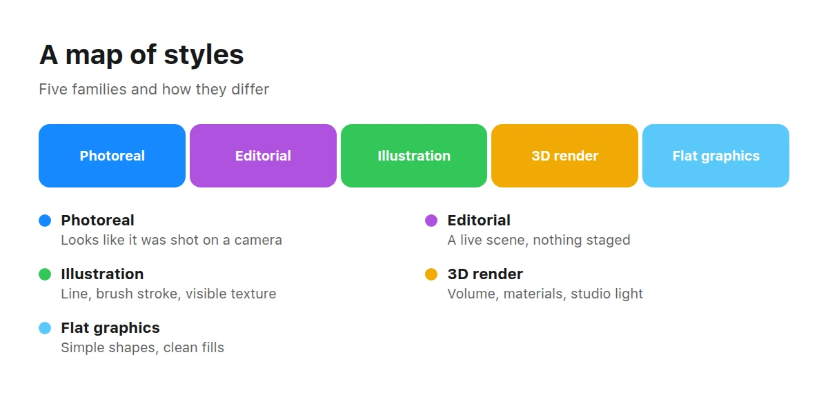
A style is named by its family and traits, not by an artist’s name.
Browse the section to compare how technique, line and degree of stylisation change the same kind of subject.
How can you describe a style in words rather than with an artist’s name?
Replace the creator’s name with a list of observable features in their work, without trying to reproduce their personal manner as a whole. This is more careful in copyright terms and more useful for the result: a name does not explain which period, work or trait you mean, while specific properties can be aligned with one another.
Analyse an aesthetic in layers. First identify the medium: photography, printmaking, paint, paper or digital volume. Then note the shape: geometric or organic, precise or deliberately uneven. Examine contour, depth, background, colour range and distribution of light. Finish with the mood created by these decisions.
This makes the description explainable. If the result is too flat, you can adjust volume or light without abandoning the other traits. If the palette does not suit the task, it can be replaced while retaining shape, material and detail.
How does a written reference differ from an image reference?
A written reference spells out its traits, while a reference image conveys visual relationships that are hard to name. Words are easier to carry between generators and discuss with a team: everyone can see which elements are essential and which can change. An image can show a complex rhythm, texture or colour relationship, but may also bring unwanted composition, objects and details along with the trait you need.
Treat an image not as a command to “make the same thing”, but as material for analysis. Ask exactly what attracted you: large areas of empty space, muted colours, soft shadow edges, a rough surface, or strict geometry combined with a hand-drawn line. After this analysis, the meaningful part of the reference becomes words and becomes controllable.
In the Picwin mini app, authors do not attach a reference image or type a prompt themselves. The model suggests several text options for the brief; the author browses them and chooses one. Words are therefore the only reference here: understanding visual traits makes it easier to see how the options differ and how each one may change the shot’s aesthetic.
How can you repeat an aesthetic step by step?
Repetition begins not by finding a short label, but by recording stable traits. Keep the properties that make a series recognisable, and change subject details separately.
Analyse a shot you like
Separate subject from treatment. Write down medium, shape, light, colour, surface, level of detail and mood; do not include specific objects unless they should recur.
Choose a family
Decide on the foundation: photography, editorial photography, illustration, 3D render or flat graphics. Do not mix families without a clear reason.
Name the palette
Describe colour temperature, saturation and relationships: for example, warm neutrals with one cool accent. For a series, retain one principle rather than a random list of shades.
Refine material and texture
Name the surface and production method: matte paper, smooth ceramic, rough print or translucent glass. The texture should suit the chosen family.
Set the degree of stylisation
State how close the shape is to reality: plausible, gently simplified, geometric or symbolic. Add the desired density of fine detail.
Check the traits for conflicts
Read the description as one technical specification. If it asks for a flat symbol, photographic microtexture and complex volumetric light at once, decide which trait matters most and remove or weaken the others.
For a series, create a short core of unchanging traits. It may include family, palette, material, character of light and degree of stylisation. Subject, object and format change around this core without breaking the shared visual language.
Before and after — how is “beautiful” different from a described aesthetic?
A described aesthetic is different because every meaningful word relates to a visible property. “Beautiful” expresses an assessment but offers no criterion for choosing shape, colour or material.
Before
“Beautiful modern still life with cosmetics, stylish and premium”
- beautiful — expresses an assessment but does not describe how the shot works;
- modern — allows too many visual interpretations;
- stylish and premium — names an impression without the traits that create it.
After
“Editorial still life with cosmetics, large simple shapes, matte stone and translucent glass, cool grey-beige palette, soft side light, restrained detail, ample empty space”
- editorial still life — sets the family and directed character;
- large simple shapes — defines the composition’s geometry;
- matte stone and translucent glass — sets materials and textures;
- cool grey-beige palette — holds the colour scheme together;
- soft side light — creates volume without harsh drama;
- restrained detail — stops small elements competing with the product;
- ample empty space — leaves room for text and helps the object read clearly.
The second version will not produce an identical shot on every run, but it leaves fewer choices to chance. If the result needs adjusting, you know which part to change: warm the palette, reduce the texture or shift the direction of light.
When does style conflict with the task?
Style conflicts with the task when a decorative device prevents an image from serving its function. The shot’s purpose matters more than an aesthetic effect: a product card needs a clear object, a banner needs room for text, a sign must be recognisable at small size, and a magazine illustration needs an expressive idea.
A useful check is to mentally remove decorative traits and ask whether the composition still solves the task. Then restore only the properties that support its meaning. If generation introduces visual errors, distinguish an aesthetic conflict from a technical defect; typical cases are covered in common generation mistakes.
IconsThe section makes it easy to see how limited detail, a clear silhouette and consistent geometry work for small-format images.
How is style chosen in Picwin?
In Picwin, style is selected by comparing text options for one brief. The author chooses a task level and taps “Find a task”. The brief comes from the catalog and combines the category topic, the shot’s purpose—such as a banner, product card, article or brand post—and conditions defining what must not appear in the frame.
No prompt is entered manually. The model offers several text options with different starting conditions: framing and angle, light, palette, mood and photographic treatment. The author browses them and chooses the aesthetic that best fits the brief. Understanding families, materials and stylisation helps assess likely changes in the image rather than the appeal of individual words.
The author also sets the generation budget, called “power” in the mini app; it determines the model and prompt detail. Finished work is reviewed. The platform buys an accepted work together with the rights, after which it appears as a card in the stock catalog and is available to buyers under licence. Demo mode lets authors try the process without spending money, but demo work is not published and earns no points.
Key takeaways
- Define style through a family and observable traits, not evaluative words.
- Replace an artist’s name with material, shape, palette, light, texture and detail.
- A written reference is explainable and portable, while an image may import unwanted details with the desired aesthetic.
- For a series, keep a stable core of traits and change the subject separately.
- Aesthetics should support the shot’s purpose, not obstruct the object or text.
- In Picwin, choosing a text option for a brief also chooses its visual conditions and aesthetic.
What else should you know about styles and references?
These short answers help check the wording before choosing an option or starting generation.
Can you use artists’ names in a prompt?
It is better not to use artists’ names instead of a description. This raises legal and ethical questions, while the result remains unpredictable because a name does not specify the required palette, material, period or degree of stylisation.
What does photorealism mean in practice?
It means plausible materials, light, perspective, depth and scale that make an image feel like a photograph. Add the type of photography, character of light and surface properties to the word “photorealism”.
How should you define a colour palette?
Describe colour temperature, saturation and relationships instead of listing many random shades. Wording such as “a muted warm palette with one cool accent” sets a clear principle that is easier to retain across a series.
Why does style drift between generations?
Every run leaves room for variation, especially when traits are general or contradictory. Fix the family, palette, material, light and degree of stylisation, and separate the changing subject from this core.
What should you do when you need a series in one style?
Create one set of unchanging traits and use it throughout the series. Also retain a similar principle of composition and light while changing objects and actions separately; after each result, check each trait rather than only the overall impression.
Is writing “minimalism” enough?
Usually not: minimalism can mean few objects, simple shapes, a limited palette, empty space or no texture. Specify exactly which restrictions are needed and what function they perform.
Which matters more, a reference or the image’s purpose?
Purpose matters more because it determines whether the product must read clearly, where room for text remains and how much stylisation is acceptable. Take from a reference only those traits that do not obstruct this function.