

In short
A cliché in a business image is not merely unattractive; it carries no message. A handshake or a rising chart fits every company and therefore says nothing about yours. The replacement is always more specific: a workplace, document, process detail, or city outside the window. Here is how to replace the most overused subjects.
The business section is the most predictable part of almost any stock library. The reason is simple: finance and management are hard to photograph. Work is visible through its result, and that result is often a spreadsheet. So the same symbols persist for decades: coins, upward arrows, handshakes, and suits beside panoramic windows. Here is how to get an image by tomorrow without looking generic.
Why do business stock images all look the same?
Because they illustrate the word rather than the meaning. “Growth” becomes an arrow, “partnership” a handshake, and “profit” a pile of coins. This translation works as a pictogram, but when it occupies the space of a full illustration, it adds no new information.
A strong business image always has specifics: whose work it is, where it happens, and what the person is doing. One self-explanatory detail — a folder with a real document, a working spreadsheet, a checkout, warehouse, or workshop — makes the image harder to swap for any other.
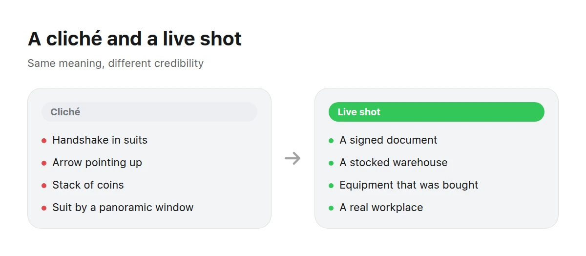
On the left, anything that fits anyone. On the right, what speaks about your business.
Which subjects should be retired, and what can replace them?
Here are five of the most common clichés and a concrete replacement for each.
A handshake between people in suits. Show the transaction itself: a signed document, the meeting table after the discussion, or a shared board on screen. Agreement is conveyed by its trace, not the gesture.
An upward arrow and growth chart. Show the thing that grew: a shelf that needed extending, a larger shipment, or a queue at the checkout. Growth is visible through increased load, not the direction of a line.
A stack of coins and fanned banknotes. Money usually lies in an image because it has no useful scale. Replace it with what the money becomes: equipment, renovation, a payroll sheet, or a receipt.
A suit beside a panoramic window. Use a real workplace instead: an accountant’s office, branch counter, driver’s cab, or restaurant kitchen.
A clock, hourglass, or “time is money” image. Show waiting or a deadline: a queue, a marked-up calendar, or an office late at night.
What does a business image need technically?
The demands are stricter than for a simple ad because business visuals appear in reports, presentations, and print, not only on screens.
Checklist before placing an image in a report
- Use 16:9 landscape for slides, and 3:2 or 4:3 for report pages.
- Keep the longest side at 2000 pixels or more if the document will be printed.
- Avoid readable figures, charts, and labels that can date or contradict your text.
- Remove recognisable logos, close-up banknotes, and imitations of official documents.
- Leave a quiet area for a heading and caption.
- Make sure people dress and behave plausibly for the industry and country.
- Check that the image remains legible in black-and-white print.
- Do not imply something the company does not do; a borrowed skyscraper office undermines a small firm’s credibility.
Where does a business image belong, and where does it not?
Separate two modes: illustrating mood and illustrating fact.
Mood — an image works
- A report or section cover
- A website header or service landing page
- A slide background or presentation divider
- A vacancy card or About page
- A blog article illustration
Fact — use data, not an image
- Metrics, trends, and market share
- Portfolio composition and cost structure
- Pricing and terms comparisons
- Anything a reader can recalculate
Mixing these modes creates distrust. Put a decorative chart beside a real figure, and the reader starts doubting both.
How can you illustrate data without drawing figures?
Separate the information from its presentation. A chart built from your data shows the facts; imagery handles the surrounding section cover, spread background, or pause between chapters. An illustration pretending to be a chart is the worst option because readers try to interpret it.
Three combinations work:
- A section cover followed by a real chart. An atmospheric image opens the chapter; the figures live on the next page.
- An object instead of a metric. Show warehouse occupancy with stocked shelving rather than a bar. Keep the actual figure in the text.
- A backdrop beneath the data. Put a chart built in the layout over a quiet texture or gradient. The graph stays editable and the page feels designed.
What jobs can ready-made images handle?
Business teams typically come for images to solve five tasks.
An annual report or investor presentation
Covers, chapter dividers, and quotation backgrounds. A coherent series makes a document feel unified more effectively than any typeface.
A service website for consultants, accountants, or lawyers
Show real work rather than abstract “professionalism.” Industry detail is what separates the business from its competitors.
A financial product for banking, insurance, or investment
Use calm scenes and objects. Treat visible money carefully: symbols of wealth often undermine trust rather than build it.
Recruitment and internal communications
Workplaces, teams, and processes. A lived-in environment convinces a candidate more effectively than a slogan.
Blog and email
A cover for every piece. Consistency matters here too: people recognise an email’s look before its subject.
What should you check when an image contains people?
People are the riskiest part of a business visual because viewers spot inauthenticity in them first.
Age and team composition. A board made entirely of twenty-year-olds and a call centre staffed only by fifty-year-olds look equally staged. The people in the image should resemble those a visitor would meet at the business.
Clothing. A tie and suit in an industry that wears polos and hoodies reads as someone else’s image. The reverse is also true: an overly casual scene can damage a conservative service.
Activity. A person should be doing something, not posing. The difference between “employee looking at the camera” and “employee reviewing a document” is the difference between advertising and explanation.
Hands and objects. In generated images, hands, keyboards, pens, and badges often reveal errors. Inspect the full-size image rather than the thumbnail: everyone will notice an extra finger in a report on a large screen.
The setting. An empty desk, anonymous meeting room, and perfect order all look staged. A little working mess makes the frame credible faster than almost any other detail.
BusinessBusiness: workplaces, negotiations, documents, and processes — the tangible base of business visuals.
Finance: transactions, banking settings, and the objects of money in motion, without the swagger.
People: portraits and human scenes for About pages and careers sections.
City: streets, business districts, and transport — the environment where work happens.
If no section fits, browse the full catalogue; search covers each work’s title and description.
How can you build a series instead of collecting random images?
Keep three things consistent across every image: light, palette, and distance from the subject. A report with a warm evening cover and cold office dividers feels spliced together from two documents.
Use a practical order. Choose the hero first — the cover image that establishes the style. Then find dividers with the same palette and light direction but a different shot scale. Add the smaller pieces last: quotation backgrounds, backdrops, and email images. Reverse that order and the cover usually needs reworking when it matches nothing inside.
Keep the set slightly broader than today’s requirement. Two spare images in the same style can cover a surprise section added the day before delivery.
If the right subject does not exist, build it yourself. Industry specificity is often exactly why a ready-made image cannot be found.
Related reading: marketplace image requirements, the visual set for a technology product, and travel visuals without the trip.
Can money appear in the image at all?
Yes, when money is part of a scene rather than its entire meaning: payment, change, or a checkout. Close-ups of notes and coins become symbols and usually look cheap. Check local rules on depicting banknotes separately.
How can you show growth without an upward arrow?
Show its consequences: more goods, people, floor space, a queue, or an expanded warehouse. Put the actual growth figure in text with a source.
What if the image needs industry-specific detail?
Search by industry rather than “business.” Manufacturing, construction, healthcare, and education each have a distinct physical setting, and that is what makes an image credible.
Is a generated image suitable for an annual report?
Yes for covers, dividers, and backgrounds. Not for documenting a specific site, event, or employee; that is an evidentiary role and requires photography.
Must a generated image be labelled?
There is no universal requirement for business publications, but a label helps when an image might be mistaken for documentary evidence. In regulated sectors, check the rules of your regulator and publication platform.
How can I test an image for clichés in one minute?
Put a competitor’s name and the word “partnership” beneath it. If the caption still fits, find another image.