

In short
An image should be delivered at the size at which it is displayed, in a modern format, with its dimensions declared in the markup. As a guideline, keep the main above-the-fold image under 200 KB and other images under 100 KB. A good loading threshold is 2.5 seconds until the page’s largest element appears.
A heavy image does not hurt some abstract notion of “speed”; it costs a specific second—the one in which a visitor sees the page’s main image. That image is usually the largest element, so it determines whether the page meets the threshold.
Why do images determine page speed?
Because they are almost always the heaviest and most noticeable elements on a page. The Core Web Vitals overview names three metrics; images directly affect two:
- LCP — the time until the largest element is rendered. A result of 2.5 seconds or less is considered good;
- CLS — cumulative layout shift. 0.1 or less is considered good.
Both thresholds are measured at the 75th percentile of page loads. In other words, three quarters of visits must meet the target, including on a slow phone, not just on your laptop.
How large can an image file be?
Work from connection speed, not intuition. A speed of 5 Mbps is 5,000,000 ÷ 8 = 625,000 bytes per second, or about 610 KB/s. So a 1 MB image takes roughly 1.7 seconds to reach the reader—and that excludes connection setup and competition from the page’s other files.
This gives us a budget that is easy to verify with basic arithmetic.
| Role on the page | File-size guideline |
|---|---|
| Main above-the-fold image | up to 200 KB |
| In-article illustration | up to 100 KB |
| Catalog grid preview | up to 40 KB |
| Icon or avatar | up to 10 KB |
It helps to remember where those megabytes come from. An uncompressed 1920 × 1080 frame at three bytes per pixel is 1920 × 1080 × 3 = 6.2 MB. Anything smaller is the result of compression, and the entire difference between 6 MB and 150 KB depends on how the file was saved. Our article on JPEG, PNG, WebP, and AVIF explains which format to choose.
What dimensions should the delivered file have?
Exactly the displayed dimensions multiplied by screen density—and no larger. A 4000-pixel file in a slot 400 CSS pixels wide will not look better: the browser will scale it down anyway, wasting both bandwidth and memory.
In practice, 2× density is the useful limit. The difference between 2× and 3× is barely visible, while the area, and therefore the weight, grows 2.25 times. The article on image size, resolution, and DPI explains how to calculate slot width and density.
One slot usually needs several files because a phone and a large monitor display
the same image at very different widths. That is what srcset and sizes are
for: the browser selects the right file based on slot width and screen density.
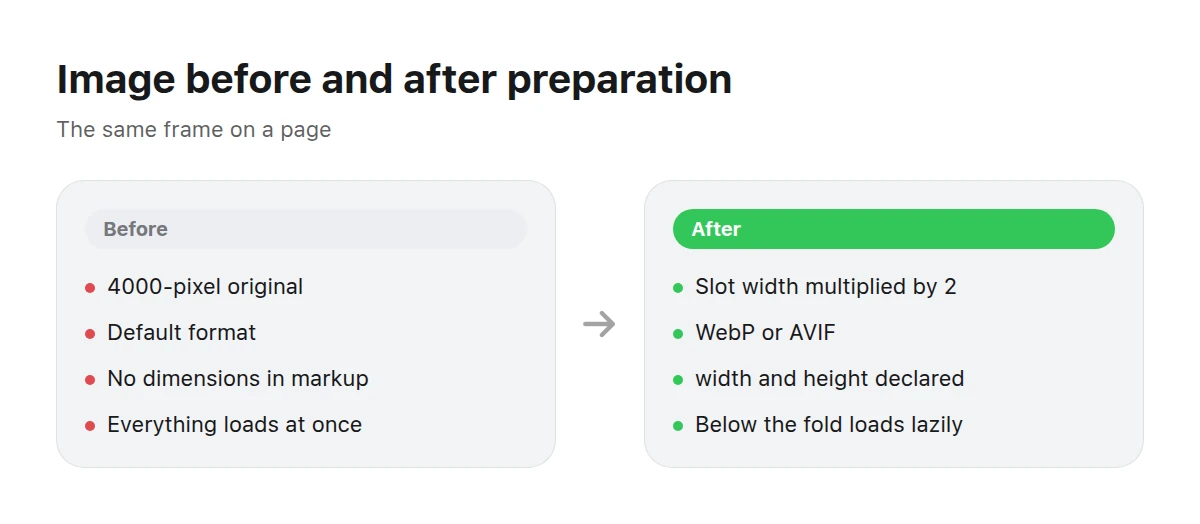
Preparation is not one action but four: dimensions, format, markup, and caching.
How do you prepare an image for a website?
Crop it to the required aspect ratio
Pixels that will not appear in the page’s frame should not be in the file.
Resize to the slot width multiplied by 2
Resize once from the original rather than through a chain of intermediate sizes.
Save in a modern format
Use WebP or AVIF with a JPEG fallback. Keep transparency only where it is needed.
Create a second and third size
For example, 400, 800, and 1600 pixels wide, all listed in
srcset.Declare dimensions in the markup
Use
widthandheightattributes oraspect-ratioin CSS so the browser reserves space before loading.Set priorities
Give the main image
fetchpriority="high"and everything below the foldloading="lazy".Test on a slow connection
Enable network throttling in developer tools and see what a visitor sees during the first two seconds.
How many sizes should srcset contain?
Three or four steps are usually enough. A gap of roughly one and a half times between adjacent sizes works well: 400, 600, 900, and 1400 pixels. More frequent steps save little bandwidth—the weight grows with area, and the difference between 800 and 900 pixels is about 25% of the bytes—but multiply the work of preparing and storing files.
Choose steps from the layout, not from round numbers. Check the slot width on a
phone, tablet, and wide monitor, then take those three values and double each
for high-density screens. The sizes attribute is essential: without it, the
browser assumes the image fills the viewport and downloads a file that is
needlessly large on a phone.
How can you find what is slowing the page down?
Measure it instead of guessing. Open the Network tab in developer tools, sort requests by size, and inspect the first five rows—in the overwhelming majority of cases, they are images. Then enable throttling and reload the page to reveal which file delays the first screen.
Also compare the dimensions of the delivered file with the dimensions at which it is displayed. The browser shows both values in the element tooltip. If the file is more than twice as wide as its slot, you have found the excess weight.
How do you prevent layout shifts?
Declare dimensions. Until the browser knows an image’s aspect ratio, it gives the image zero height. Once the file loads, the page expands and the text moves down just as someone starts reading. That is layout shift, and it contributes to CLS.
One line fixes it: set width and height on the img tag using the file’s
actual proportions. Modern browsers derive the aspect ratio from these values
and reserve the space even when CSS sets the width as a percentage.
What do caching and a CDN do?
Caching handles the second and all subsequent loads: the browser does not request a file again when it is allowed to retain it. This is safe for images when the URL changes with the content—for example, when the filename includes a content hash. You can then set a long cache lifetime without risking an old version being shown.
A CDN handles distance: the file comes from a server closer to the reader. For an audience spread across several countries, this often helps more than saving another twenty kilobytes.
What happens when an image is overcompressed?
Lossy compression works in blocks. When quality is set too low, three familiar defects appear: 8 × 8-pixel squares in flat areas, halos along sharp edges, and bands instead of a smooth gradient. Skies and studio backgrounds suffer first.
These defects are irreversible and cumulative. Every resave of an already compressed file adds new artifacts on top of the old ones, so edits should always start from the original.
What does this mean for stock images?
A stock image arrives at a large size, which is right for a source file and wrong for a web page. When preparing it for publication, follow the usual path: crop, resize, choose a modern format, and declare dimensions in markup. On the Picwin storefront, a work’s preview is a 1024-pixel square, and it is displayed at an even smaller size in the catalog grid.
TechnologyScenes featuring interfaces, devices, and data are common heroes for lightweight pages.
Business scenes for landing pages where the main visual determines the first second.
Key takeaways
- A good load threshold is 2.5 seconds to the largest element, at the 75th percentile.
- Calculate weight from the connection: 1 MB at 5 Mbps takes about 1.7 seconds.
- File width equals slot width multiplied by 2, and not one pixel more.
- Declared dimensions prevent layout shifts at no cost.
- Lazy loading is for everything except the main image.
How large should a good website image be?
Keep the main above-the-fold image under 200 KB, an in-article illustration under 100 KB, and a grid preview under 40 KB. These are guidelines derived from connection speed, not rigid rules.
What should the total weight of images on a page be?
Low enough for the main image to appear within 2.5 seconds. Everything else can and should be deferred with lazy loading.
Does WebP help if the image is already small?
Yes, but the gain will be in kilobytes, not seconds. Start with dimensions: a file twice as wide as its slot wastes far more than a poor format choice.
Should PNG icons be compressed?
Icons are almost always better delivered as vectors. If you need a raster file, reduce the palette: a 64-color PNG weighs several times less than a full-color one.
What matters more: file size or number of files?
Today, file size. Modern connections handle dozens of parallel requests, but nothing can make unnecessary megabytes travel faster.
Why is the page fast for me but slow for visitors?
You have a good connection and everything is cached. Look at the 75th percentile and enable network throttling in developer tools.
How can I check that it improved?
Measure the time to the largest element before and after your changes using the same throttling setting. Unmeasured impressions are almost always misleading.
Continue with dimensions and resolution, choosing a format, and preparing images for print—the same pixels follow different rules there. Browse finished works in the catalog.