In short
An image’s dimensions are its pixels, nothing else. Dots per inch enter the picture when those pixels are put on paper: physical size is pixels divided by ppi. For a screen, calculate the slot width in pixels and account for display density; for print, divide millimetres by 25.4 and multiply by 300.
One idea resolves half the questions about image size: a file has no centimetres. It contains a pixel grid—for example, 4000 × 3000. Centimetres and inches appear later, when that grid is displayed on a particular device or transferred to a particular sheet of paper.
How is resolution different from size?
A file’s resolution is the number of pixels horizontally and vertically. 4000 × 3000 is 12 million pixels, or “12 megapixels.” The file says nothing else about its physical dimensions.
Dots per inch (dpi) and pixels per inch (ppi) are not properties of the image, but the density at which it will be printed or displayed. Strictly speaking, ppi applies to an image and screen, while dpi applies to a printing device. In everyday use and print-shop specifications, however, the terms are often used interchangeably.
A JPEG or TIFF does contain a ppi value, but it is merely a hint for an editor. Changing that hint from 72 to 300 adds no pixels to the file. It only changes the size at which the editor places the image on paper.
How do you convert millimetres to pixels?
There is one short formula:
pixels = millimetres ÷ 25.4 × ppi
Twenty-five point four is the fixed number of millimetres in an inch. This formula produces the entire standard print-size table at 300 ppi.
| Format | Millimetres | Pixels at 300 ppi |
|---|---|---|
| Business card | 85 × 55 | 1004 × 650 |
| 10 × 15 photo | 100 × 150 | 1181 × 1772 |
| A6 postcard | 105 × 148 | 1240 × 1748 |
| A5 flyer | 148 × 210 | 1748 × 2480 |
| A4 sheet | 210 × 297 | 2480 × 3508 |
| A3 poster | 297 × 420 | 3508 × 4961 |
The reverse calculation works the same way: divide pixels by ppi to get inches, then multiply by 25.4 to get millimetres. A 2000 × 1500 frame at 300 ppi is 169 × 127 mm, slightly smaller than A5. At 150 ppi, the same frame becomes 339 × 254 mm, almost A4, but with half the detail density. For a closer look at when 150 ppi is enough and when it is not, read our guide to preparing images for print.
How many pixels does a screen need?
As many pixels as the image occupies on the page, multiplied by the screen density.
Layouts are measured in CSS pixels, while a display usually has more physical
dots. Retina phones and laptops show two or three dots for one CSS pixel. The
browser calls this value devicePixelRatio. If an image occupies 800 CSS
pixels in width, its actual width on a display with a density of 2 is 1600
pixels.
This gives us a practical rule: file width = slot width × 2. There is no need to chase a larger multiplier. The difference between 2× and 3× is barely visible, while file weight grows with area—by 2.25 times. Our article about fast images for websites explains how to handle that extra weight.
Which aspect ratios should you choose?
Aspect ratio matters more than absolute size. Size is easy to reduce, but changing the ratio requires cropping, and cropping can ruin a composition.
| Aspect ratio | Common uses |
|---|---|
| 1:1 | catalogue previews, avatars, product cards |
| 4:5 | vertical feeds, mobile posts |
| 3:2 | classic camera frame, photo printing |
| 16:9 | covers, slides, video frames |
| 1.91:1 | social-media link preview (og:image) |
| 9:16 | vertical video and stories |
Calculate what is lost when reframing. Converting a 3:2 shot to 4:5 preserves 0.8 ÷ 1.5 = 0.53 of its width, so nearly half the frame disappears. A subject intended for both a feed and a cover should therefore be shot or generated with extra space around the edges.
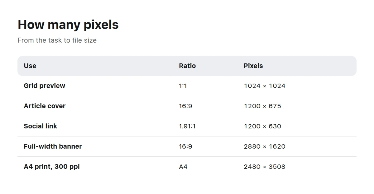
Count pixels from the use case, not the other way around: slot first, then density.
What dimensions do platforms require?
Platform requirements change, so their own help pages are the only reliable source. At the time of publication, the official documentation gives the following specifications.
| Platform or use | Requirement |
|---|---|
| Social-media link | from 1200 × 630, minimum 200 × 200, file up to 8 MB |
| YouTube thumbnail | 3840 × 2160, minimum width 640, JPG or PNG |
| Picwin article cover | 1200 × 675 |
| Picwin work preview | square 1024 × 1024 |
The first two rows come from the Open Graph image requirements and YouTube thumbnail help. They also state file-size limits: 8 MB for a link preview and 2 MB for a thumbnail uploaded from a phone. The final two rows are our own dimensions, declared in the website markup.
How do you choose dimensions for a task?
Identify the final medium
Screen, print, or both. Until this is decided, there is no basis for choosing a pixel count.
Measure the slot
For a screen, measure the area width in CSS pixels. For print, measure the product width in millimetres.
Multiply by density
For a screen, multiply by 2. For print, convert millimetres with the formula above at 300 ppi; use a lower density for large-format work.
Round up sensibly
An extra two hundred pixels costs virtually nothing, while a shortage of two hundred forces you to enlarge the image.
Choose the ratio for the tightest platform
If you need both a square and a wide frame, generate a wide version with extra space at the edges and crop the square from it.
Keep the source file
The maximum-size original is the only way to produce another size later without further loss.
What happens when an image is reduced?
Downscaling is also resampling, just a less painful kind. Four neighbouring pixels become one, and fine details are averaged: thin lines fade, lettering on a sign becomes unreadable, and noise turns into uniform grey.
Two rules follow. First, reduce an image in one step rather than a staircase of 10% reductions: every step averages the pixels again. Second, after substantial reduction, apply a little sharpening or the frame will look dull. Sharpening must be the last operation at the final size; otherwise compression turns it into halos along the edges.
Most importantly, create every derivative from the original, not from another derivative. An image reduced to 800 pixels, stretched to 1200, and compressed again loses quality three times, even if each step looks harmless.
Can you enlarge a small image?
You can enlarge it, but you cannot add real detail. Ordinary interpolation calculates new pixels from their neighbours, making edges softer and textures mushy. AI upscaling looks better, but it does not restore what was lost. It draws plausible additions, inventing hair, letters, and tiny patterns.
A practical limit for screens is roughly twofold enlargement, provided viewers will not inspect the image closely. For print, check any enlargement at 100%: the screen displays the image reduced and gives a misleading impression of sharpness.
What does this mean when using a stock library?
When you select an existing image, its dimensions have already been decided, so check them before buying, not afterwards. Picwin works are created by neural networks from catalogue briefs. The storefront preview is 1024 pixels on one side, while the final dimensions are shown on the work’s page.
TechnologyFrames about devices, interfaces, and data—subjects that most often need both wide and square versions.
Mockups and backgrounds, where ratio matters most because the frame is later cropped to fit a layout.
Key takeaways
- File dimensions are pixels; ppi appears only with a physical medium.
- To convert millimetres to pixels, divide by 25.4 and multiply by density.
- For screens, use the slot width multiplied by 2.
- Choose the aspect ratio in advance: it can only be changed by cropping.
- Enlargement adds no real detail, whether conventional or AI-powered.
What size should a website banner be?
Multiply the banner width in CSS pixels by 2. A full-width laptop banner is about 1440 CSS pixels, so the file should be 2880 pixels wide.
What is 300 dpi, and is it always necessary?
It means 300 pixels per inch of paper, the standard for publications viewed at arm’s length. A poster viewed from three metres away needs noticeably lower density.
How many megapixels are needed to print A4?
2480 × 3508 = 8.7 megapixels at 300 ppi. Any modern camera and almost any high-resolution generation exceeds that requirement.
Why does an image look blurry on a phone?
The file was probably supplied at the CSS-slot size without accounting for display density: the phone stretches 400 pixels across 800 physical dots.
Can you change the aspect ratio without loss?
No. You can change it by cropping or extending the canvas. Cropping discards part of the frame; extension adds content that was not there.
At what size should the original be stored?
At the largest available size, without repeated compression. Always create every derivative from it, never from other derivatives.
What size should you choose if no platform is specified?
Use 2000 pixels on the long side. That is enough for full-screen display and printing up to A5, while keeping file weight moderate.
Continue with image formats and when to use them and preparing images for a fast website. Browse finished work in the catalogue.