
In short
Printing needs pixels, not a “300 dpi” label in the file properties. Use this formula: divide millimeters by 25.4 and multiply by the required density. Density depends on viewing distance: 300 ppi for a sheet held in your hands, around 60 for a poster viewed from three meters away. Then handle CMYK, the profile, bleed, and PDF.
Print is less forgiving of overconfidence than a screen: an on-screen mistake is visible immediately and costs nothing, while a printing mistake appears a week later across the whole run. The good news is that nearly every requirement comes down to four values, three of which you can calculate.
How many pixels do you need for print?
There is one formula:
pixels = millimeters ÷ 25.4 × ppi
There are 25.4 millimeters in an inch. Multiply by the density required for the product to get the file dimensions. The reverse works too: divide pixels by ppi to get inches, then multiply by 25.4 to get millimeters.
| Product | Millimeters | Pixels at 300 ppi |
|---|---|---|
| Business card | 85 × 55 | 1004 × 650 |
| A6 postcard | 105 × 148 | 1240 × 1748 |
| A5 flyer | 148 × 210 | 1748 × 2480 |
| A4 sheet | 210 × 297 | 2480 × 3508 |
| A3 poster | 297 × 420 | 3508 × 4961 |
| A2 poster | 420 × 594 | 4961 × 7016 |
You can check a file in reverse without opening an editor: divide its width in pixels by 300 and multiply by 25.4. The result is the product width that the file can cover at press quality. A frame 2000 pixels wide gives 169 mm, so it is enough for A5 and no larger.
Do you always need 300 dpi?
No. Three hundred dots per inch is the standard for things held in the hands: books, flyers, and packaging. Once the product moves farther from the eye, the required density falls because the eye can no longer distinguish individual dots.
| Distance | Minimum density |
|---|---|
| 0.6 m | 300 dpi |
| 1 m | 180 dpi |
| 1.5 m | 120 dpi |
| 2 m | 90 dpi |
| 3 m | 60 dpi |
| 5 m | 35 dpi |
| 10 m | 18 dpi |
These values come from The Print Handbook viewing distance and density table; it assumes a person with good eyesight under good lighting.
Consider a one-by-one-and-a-half-meter poster viewed from three meters: 1000 ÷ 25.4 × 60 = 2362 pixels wide. Blindly following the “300 dpi rule” for the same poster would require 11 811 pixels, making the file twenty-five times heavier without adding a single visible detail.
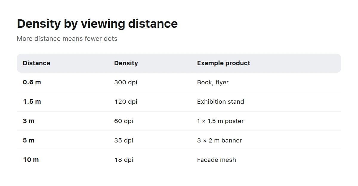
Choose density by viewing distance, not by habit.
Where did 300 ppi come from?
It comes from the mechanics of offset printing. A halftone on paper is formed by a screen, a grid of variable-size dots whose frequency is measured in lines per inch (lpi). High-quality printing on coated paper commonly uses about 150 lpi. A practical prepress rule is to make image density roughly twice the screen frequency, leaving enough source pixels for every screen cell. Thus, 150 × 2 gives the familiar 300 ppi.
This also shows that 300 is not a magic number but a consequence. Where the screen is coarser, as in newspapers, large-format printing, or screen printing, the source need not be as dense. Conversely, a “600 dpi” requirement for a raster image is almost always a misunderstanding: that density is useful for line art and text, not photographs.
Why do colors look different on paper?
Because print creates color in a different way. A screen adds light: red, green, and blue together make white. Printing subtracts it: inks absorb part of the light to create color on white paper. That is where CMYK comes from: cyan, magenta, yellow, and black inks.
Some screen colors simply do not exist on paper. Bright blues, acidic greens, and neon shades become more muted when converted to CMYK. This is not a conversion error but a difference in color gamuts.
For predictable results, an ICC profile describes a specific combination of ink, paper, and press. In Europe, ISO Coated v2 and the newer PSO Coated v3 are used for coated paper, while PSO Uncoated v3 is intended for uncoated stock. ECI distributes these profiles and explains the printing standard behind each one. Some profiles limit total ink coverage, such as “ISO Coated v2 300 %”: too much ink in one area cannot dry in time and will smear.
What are bleed and the safe area?
Bleed is extra image area beyond the trim line. A stack of paper cannot be cut with perfect accuracy, and without bleed a white strip may appear at the edge. The safe area is the reverse rule: text and logos must stay a certain distance from the edge or they may be cut off.
Both values are determined by the product, not by habit. For sheet products, bleed is usually measured in millimeters; cardboard packaging may need as much as ten. Text clearance from the trim line starts at roughly three millimeters. The only authoritative source is your print shop’s product data sheet.
For an image, this means one thing: the frame must be larger than the finished product. If you calculate the file exactly to the trim size, there is nowhere for bleed to come from, so the image will have to be stretched in the layout.
How do you prepare a file for delivery?
Check the product data sheet
Confirm the format, bleed, safe area, required density, color profile, and accepted file formats.
Calculate pixels including bleed
Convert the product width including bleed to pixels with the formula. If there are not enough pixels, change the source image, not its dpi label.
Inspect the frame at 100 %
View it at actual size rather than fit to window. Noise, compression artifacts, and soft details only become apparent this way.
Set up the color
Convert to CMYK with the profile supplied by the print shop, or leave it in sRGB and tell them.
Remove transparency and unnecessary layers
A flattened image goes to print; at this stage transparency is merely a source of surprises.
Save in the correct container
Use lossless TIFF or maximum-quality JPEG for raster images, and save the full layout as a PDF in the standard requested by the print shop.
Order a proof for an important print run
A sample print costs less than reprinting the whole run and settles color questions in advance.
Can you print an AI-generated image?
Yes, but it needs stricter checks than a photograph. Generation produces a finite-size frame that may not cover the required format. To be suitable for A3 at 300 ppi, a file must contain 3508 × 4961 pixels, which is almost 17.5 megapixels.
The second thing to inspect is fine structure. Hair, fur, fabric, and lettering may look normal when reduced on screen but turn untidy at 100 %. Printing magnifies precisely those areas.
The third issue is enlargement. Neural upscaling looks better than ordinary interpolation, but it does not recover detail; it invents plausible detail. That may be acceptable for a poster viewed from three meters away, but almost never for a catalog held in the hands.
What does this mean when using a stock library?
Before buying, check the work’s pixel dimensions rather than how it looks in the feed: those dimensions determine the format you can print. Picwin works are created to catalog briefs, and each work’s dimensions appear on its page. The storefront preview is a 1024-pixel square and is not the file you should print.
InteriorInterior scenes are a frequent choice for large-format printing.
Abstracts and textures tolerate lower density better at large sizes.
Key takeaways
- Calculate pixels with “mm ÷ 25.4 × ppi”; the file’s dpi label changes nothing.
- Choose density by viewing distance: 300 dpi is for items held in the hands.
- CMYK has a smaller gamut than a screen, and the print shop should specify the profile.
- Take bleed and safe-area values from the product data sheet, not from memory.
- Inspect an AI frame at 100 % before printing; fine structure is the most common failure.
What resolution do I need for A4 printing?
2480 × 3508 pixels at 300 ppi. That is 8.7 megapixels, a figure almost any modern camera can exceed.
How many dpi does a 3 × 2 meter banner need?
Use the viewing distance. From five meters, 35 dpi is enough: 3000 ÷ 25.4 × 35 = 4134 pixels along the long side.
Do I have to convert the file to CMYK myself?
No, and it is often better not to. Send the sRGB file and notify the print shop; their prepress team will convert it using the profile for their press.
Why are colors duller on paper than on screen?
Screen colors come from light and print colors from ink, so some screen shades are physically impossible in CMYK. Bright blues and greens suffer most.
How much bleed should I add?
Use the value in your print shop’s product data sheet. The range is broad: from one millimeter for a business card to ten for cardboard packaging.
Which format should I deliver?
Use lossless TIFF or maximum-quality JPEG for a raster image, and a PDF in the requested standard for the finished layout.
Can I enlarge an image to the required format?
Technically yes, but it will not gain detail. Enlargement can work for distant viewing, but not for publications held in the hands.
Do I need a color proof?
Yes, for an important or large print run. It is the only way to agree on color before printing rather than afterward.
Continue with image resolution, dimensions, and DPI and choosing an image file format. Printable works are available in the catalog.